
Submitted 4 months ago
React/vite/React router /react form / MUI ** multi step with dark mode

@ousey-ousey
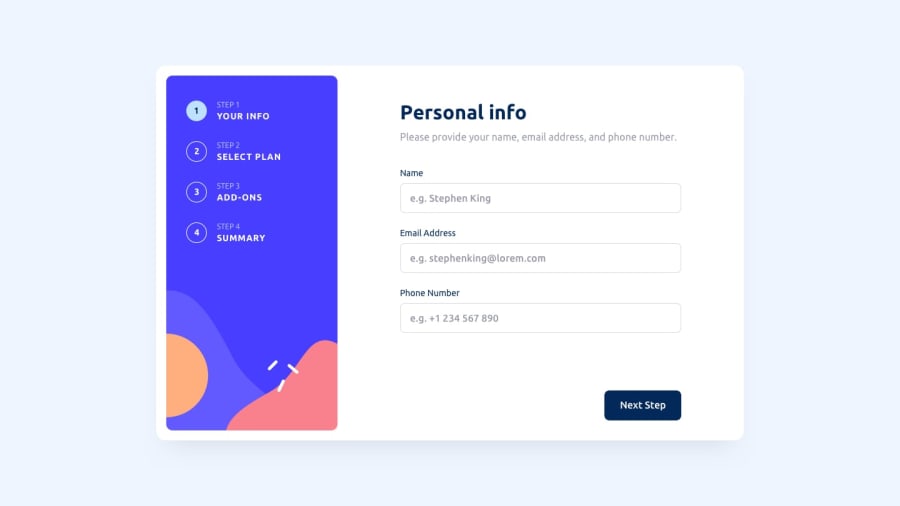
Design comparison
SolutionDesign
Solution retrospective
What are you most proud of, and what would you do differently next time?
this project nearly take 7 hours in one day
What challenges did you encounter, and how did you overcome them?some advices * upload the images in internet so you get url address so it work with you
Community feedback
- @aberllinPosted 4 months ago
Hi Yousef! It's amazing you've decided to use additional libraries and you've also added light/dark theme! Love it!
There are some of my feedback:
- The state is not persistent in the first step. When navigating back, the information entered is lost. Ensuring the state remains consistent would improve user experience.
- The step box (the square with the step number) appears too dark in the light theme, making it difficult to distinguish from the background. Adjusting the color for better contrast would help.
- On the adds-on page, the boxes become jumpy when checking/unchecking an option. This might be due to the absence of a transparent border initially, which then appears when an option is selected. Adding a consistent border could resolve this.
- Validation on the first page is preventing users from proceeding to the next step, yet they can still click the next step from the left sidebar. Ensuring that navigation through the sidebar also adheres to the validation rules would ensure a smoother process.
0

Please log in to post a comment
Log in with GitHubJoin our Discord community
Join thousands of Frontend Mentor community members taking the challenges, sharing resources, helping each other, and chatting about all things front-end!
Join our Discord