Design comparison
SolutionDesign
Solution retrospective
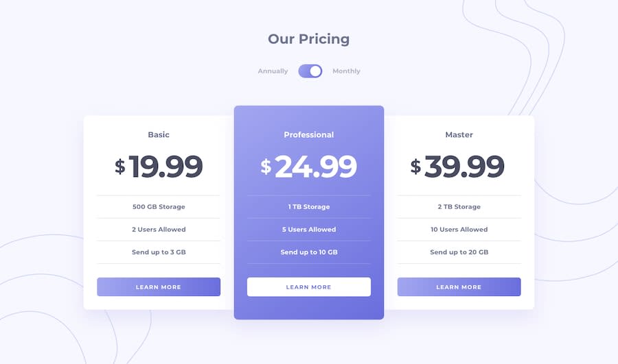
For this challenge I created a custom JSON file to load the contents displayed on the cards.
I also added an onClick event on the words beside the toggle button to switch to the desired plan. 🤠
The toggle button and the cards are inside a form. I think in a real project this would be a multi-step form and the "learn more" button would bring you to step 2 where you can see the details of the selected plan. You could switch plans if you want and then get to the payment process in the next step.
Please correct me if that thought process if wrong 😄
Community feedback
Please log in to post a comment
Log in with GitHubJoin our Discord community
Join thousands of Frontend Mentor community members taking the challenges, sharing resources, helping each other, and chatting about all things front-end!
Join our Discord
