Submitted over 1 year ago
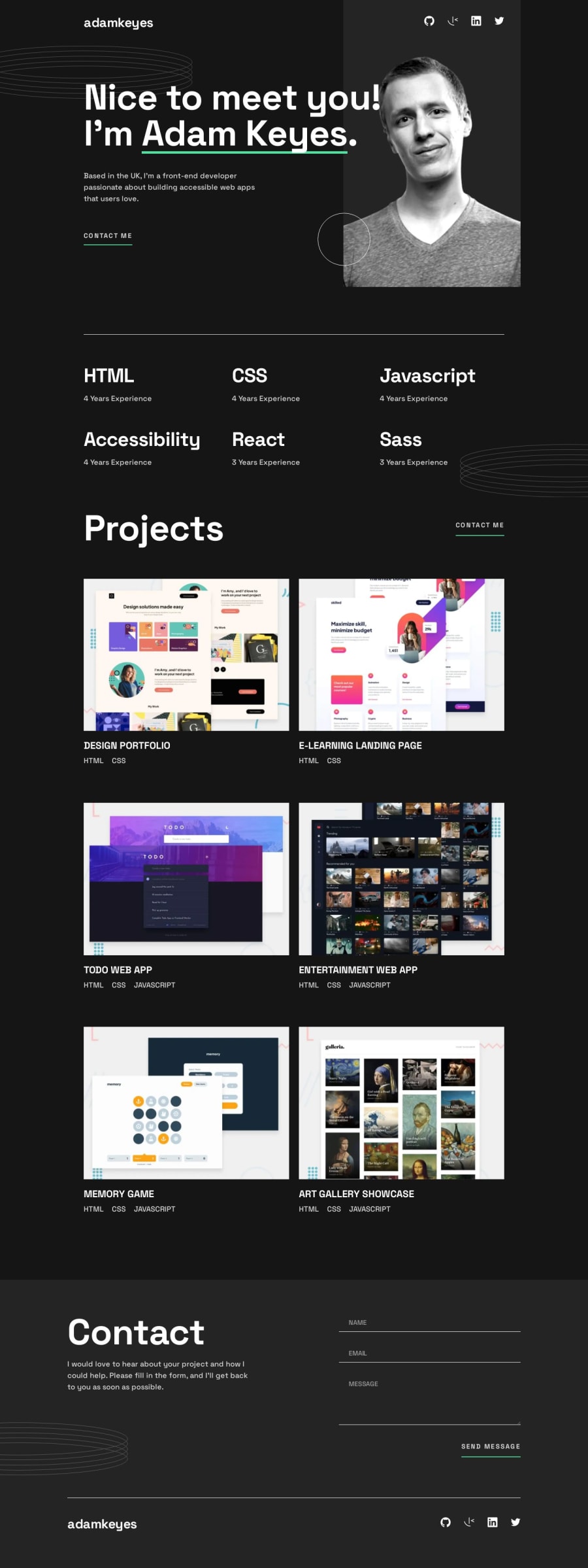
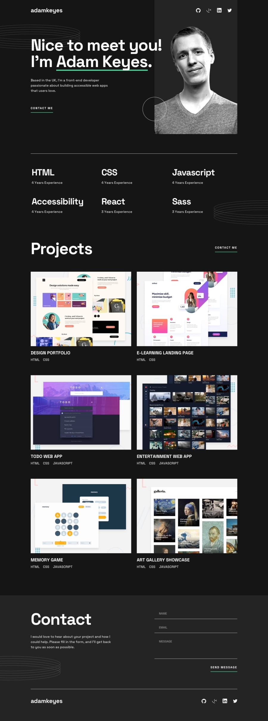
[React/TS/Less] Single-page developer portfolio
#less#react#typescript#vite#accessibility
@Dudeldups
Design comparison
SolutionDesign
Solution retrospective
The basic JSX and styling was pretty easy for me, slowly getting a 'routine' for aligning and positioning elements with CSS. Still struggled with Typescript a bit, even though I'm just using the very basics 😅
-
I added the form validation
onSubmitand alsoonBlurwhen losing focus of the inputs. -
Things I struggled with:
- Having the deco circles be outside of the section but also visible on large screens. I went with an
::afterelement, placed it in the center and usedtransformX()on it. - Getting the form validation correct using only one function for input validation
- Typescript types when passing props to components (especially when accessing an object's key with bracket notation) 😵
- Having the deco circles be outside of the section but also visible on large screens. I went with an
I read through the emailjs documentation but didn't implement it, will do for my own portfolio later 🙂
Community feedback
Please log in to post a comment
Log in with GitHubJoin our Discord community
Join thousands of Frontend Mentor community members taking the challenges, sharing resources, helping each other, and chatting about all things front-end!
Join our Discord
