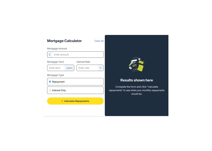


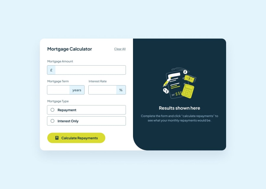
Design comparison
SolutionDesign
Community feedback
- @snigdha-sukunPosted 16 days ago
Your solution looks good but there were a few things missing:
- The hover state effects on input [both number & radio]
- The active state effects on input [both number & radio]
- The background-color of input prefix & suffix during error & active state
- The calculations for total amount/interest to be paid. You only have the monthly calculations.
- The result section has some missing elements like the box with border on top & result text etc
0

Please log in to post a comment
Log in with GitHubJoin our Discord community
Join thousands of Frontend Mentor community members taking the challenges, sharing resources, helping each other, and chatting about all things front-end!
Join our Discord