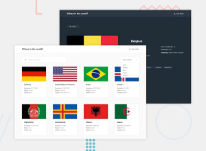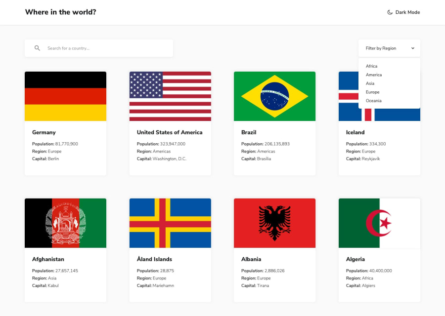
Design comparison
SolutionDesign
Community feedback
- @denieldenPosted about 2 years ago
Hi Akinyemi, congratulations on completing the challenge, great job! 😁
Some little tips for optimizing your code:
- use
articletag instead of a simpledivto the container card for improve the Accessibility - add descriptive text in the
altattribute of the flag images - use
ulelement for the details text of country instead of multiplep - if you want to use the title for the
hrefattribute you have to parse it inurl, it can give problems creating links with empty spaces or special characters - I would also add a query reset button, I find it very convenient
- in the filters there is no way to return to all countries after choosing a region, add an entry "all region"
- to make all flag images the same height use the
object-fit: cover and aspect-ratio: 3/2properties
Hope this help! Happy coding 😉
1@Akinyemi04Posted about 2 years ago@denielden Thanks For The correction It helps alot i'll see to it..
1@Akinyemi04Posted about 2 years ago@denielden just finish fixing up the code your review will be much appreciated. Hope to Here From You Soon
1 - use
Please log in to post a comment
Log in with GitHubJoin our Discord community
Join thousands of Frontend Mentor community members taking the challenges, sharing resources, helping each other, and chatting about all things front-end!
Join our Discord
