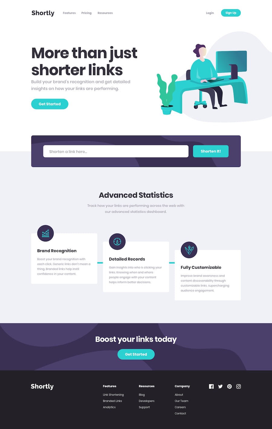
Design comparison
Solution retrospective
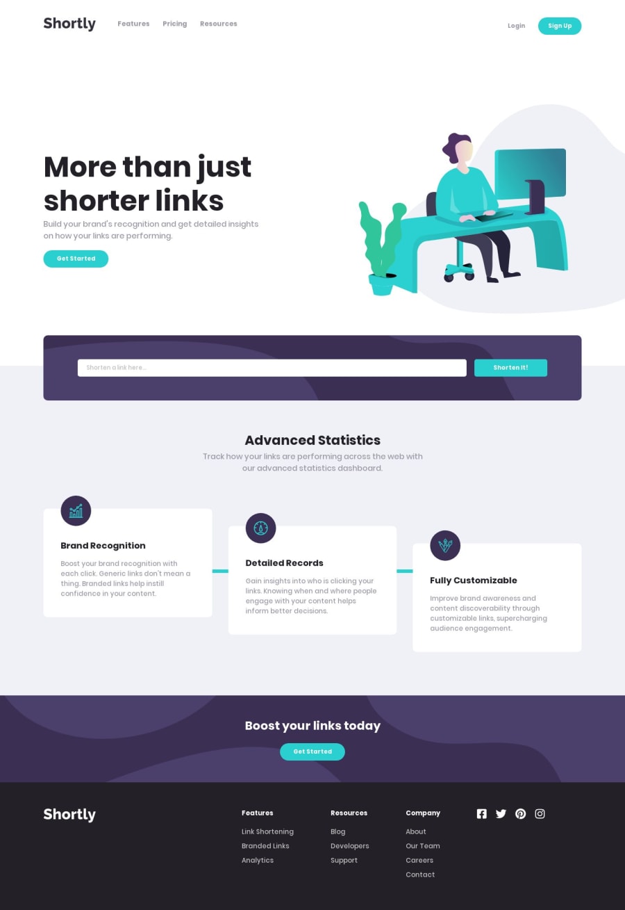
Finally, I completed this challenge which I started 8 days ago! It's not perfect and maybe I need to also implement RegExp for the user input. Any suggestions and comments are welcomed!
Community feedback
- @mattstuddertPosted almost 5 years ago
Nice work on this challenge! You sound relieved to have finished it! Don't worry too much about the time it takes to complete the challenges. You'll get faster with each new project. Just be sure to focus on what you've learned during the challenge and take any new knowledge forward with you to the next project.
Your solution looks really good and works well vs the functionality given in the brief. The only small thing I'd recommend is to review the media queries once more. For example, you're setting
height: 25rem;on the cards, which is causing content to overflow the boxes when the screen is just over600px. I would recommend avoiding setting theheightand instead, just let the height of the content inside dictate the height of the element.Keep up the great work!
1@hoehooiyanPosted almost 5 years ago@mattstuddert Thanks Matt for your kind words! I’ll review the media queries again and make the changes. Appreciate your review!
0
Please log in to post a comment
Log in with GitHubJoin our Discord community
Join thousands of Frontend Mentor community members taking the challenges, sharing resources, helping each other, and chatting about all things front-end!
Join our Discord
