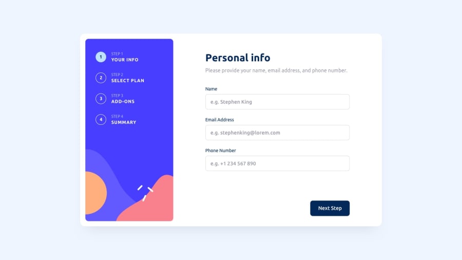
Design comparison
SolutionDesign
Solution retrospective
I most challenging thing in this project is to change and collect prices according to plan and monthly or yearly.
I think that my code needs to be more clean.
Can you me some tips to enhance my code and clean it, or to make it more reusable?.
Community feedback
- @yaadevmohitPosted 12 months ago
Congratulations on completing the challenge. Here are few things to consider for design and your code:
- Consider making border thin for inputs in step 1.
- You're doing validation for inputs in step 1 but not preventing to move to the next step.
- consider adding min height for options containers in step 2 so the height is not abruptly changing with those 2 months free p tags.
The design looks really solid otherwise and you did a great job. I'll take a look at your code later if I get time and post more feedback. Happy Coding!
Marked as helpful0@yahia997Posted 11 months agoThank you Mohit yadav for your feedback, I will work to fix these issues.@yaadevmohit
0
Please log in to post a comment
Log in with GitHubJoin our Discord community
Join thousands of Frontend Mentor community members taking the challenges, sharing resources, helping each other, and chatting about all things front-end!
Join our Discord
