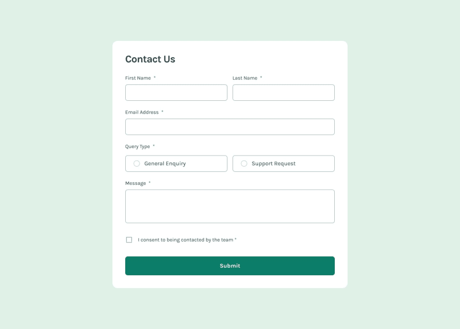
ReactJS TailwindCSS Vite Contact Form
Design comparison
Solution retrospective
I am most proud of working through each challenge that was presented in the project. I started with creating a skeleton of the design and moved on to functionality. I really enjoyed learning about the various aspects of this project.
What challenges did you encounter, and how did you overcome them?I encountered challenges related to form validation, custom checkboxes, and flexbox styling. I was able to learn about the above through research and trial/error. I was able to work through each section!
What specific areas of your project would you like help with?I would like help with the query type error message displaying on the screen. Thank you!
Community feedback
- @iyedooPosted 7 months ago
Good job! You completed the challenge but with some mistakes. Let me recap what I see is missing:
- Using height: 100vh; causes a bug of the elements exceeding that limit when there are a lot of errors.
- Missing error for query type.
- The query type button should be something we call a "radio" and it is an input that allows only one choice between 2 radios... If you replace the checkbox with radio and give each of them the same name (ex: name="radio-input") there will be only one choice possible
- It's better not to use relative widths for such projects. I personally set a fixed width and changed it with a media query for mobile design
I don't know React so I can't say how easy is it to implement those things in your code. Hope this helps! Happy coding!
0
Please log in to post a comment
Log in with GitHubJoin our Discord community
Join thousands of Frontend Mentor community members taking the challenges, sharing resources, helping each other, and chatting about all things front-end!
Join our Discord
