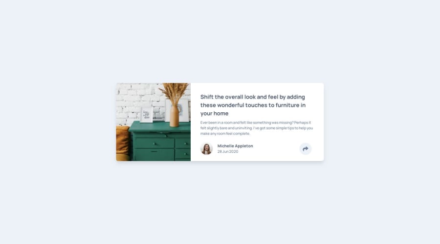
Design comparison
Solution retrospective
Did you use a css library/framework? If so, which one and why? What can I do better?
Community feedback
- @davidomarfPosted about 4 years ago
Pretty clean architecture. :) I like that you keep your components small and truly "atomic".
I only noticed one issue, and it's that if you click anywhere, as long is it's at the same height of the share button, the hidden menu gets activated.
One fix for that is placing it inside the same container as the Author element.
Another one is:
- Make the white container
position: relative;
. - Remove
margin: auto
andleft: 0
(this one gets added with.inset-x-0
) from the button container (the one with the classes"absolute z-30 inset-x-0 md:mb-2 w-full h-16 m-auto pr-10 bottom-0 cursor-pointer flex justify-end items-center"
, I cannot find a name to specifically refer to it, haha).
I haven't tried tailwinds yet. Was it good in terms of "development experience"? Still looks cryptic to me, haha.
2@catcarbonellPosted about 4 years ago@davidomarf Thank you so much for the feedback! I’ll make adjustments and let you know when I’m done updating.
TailwindCSS is amazing. You don’t have to context-switch (I.e. going back and forth from CSS to JS files), and, when you get more familiar with it, I can see the speed of creating Frontend for apps increase exponentially. Try it!!
0 - Make the white container
Please log in to post a comment
Log in with GitHubJoin our Discord community
Join thousands of Frontend Mentor community members taking the challenges, sharing resources, helping each other, and chatting about all things front-end!
Join our Discord