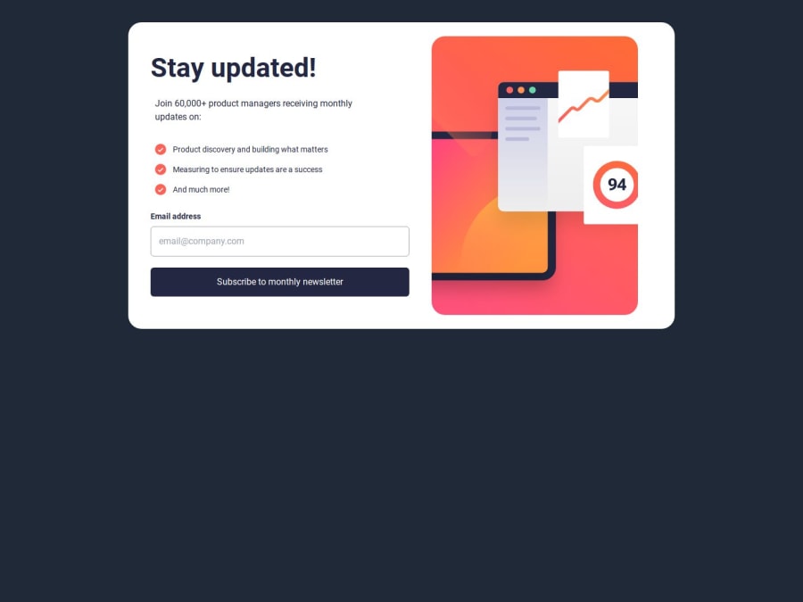
Design comparison
Solution retrospective
i think i should be proud of completing this challenge
What challenges did you encounter, and how did you overcome them?Handling the useState
What specific areas of your project would you like help with?any help or advice is very appreciated
Community feedback
- @SvitlanaSuslenkovaPosted 7 months ago
body { display: flex; flex-direction: column; justify-content: center; align-items: center; min-height: 100vh; } Try this to align(top-bottom) and justify(left-right) your project to the center. It applies to the parent component(body), don't forget about !!min-height!!. You can use grid instead of flex too.
0@Provee510Posted 7 months agoThanks for the head's up i sure will do more touches on that @SvitlanaSuslenkova
0
Please log in to post a comment
Log in with GitHubJoin our Discord community
Join thousands of Frontend Mentor community members taking the challenges, sharing resources, helping each other, and chatting about all things front-end!
Join our Discord
