Design comparison
Solution retrospective
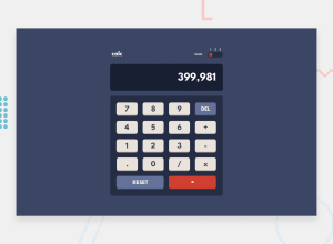
Hi, thanks for checking out my solution for this challenge. I built most of the features right, though I am still not quite satisfied when it comes formatting the number correctly, when arithmetic signs are clicked.
If someone could help point me in the right direction, I'd be extremely grateful.
Much thanks to all of you.
Community feedback
- @grmajikPosted over 3 years ago
Why do I have to click either 1 2 or 3 to switch theme? I'd like to click on the thumb to switch themes.
Marked as helpful0 - @iamtridwanPosted over 3 years ago
Good job here. But I noticed the display for mobile is not suited for mobile devices. You could set the width using media query like so wrapper{ width:90%; margin: 10px auto; } the wrapper is the container for the calculator itself. Moreso the margin top and bottom could be optional or may be set to zero.
Marked as helpful0@akaahlPosted over 3 years ago@iamtridwan Thanks for the feedback, I've updated accordingly.
0 - @akaahlPosted over 3 years ago
Finally fixed the formatting issues, based on the solution from:
https://stackoverflow.com/questions/68150876/how-to-format-number-correctly-in-a-calculator-app-react
Credit goes to Avinash Thakur.
0 - @palgrammingPosted over 3 years ago
Well the first thing I see is you should limit the
.so it cannot be used more than once in a number. So the user cannot type this5...............50@akaahlPosted over 3 years ago@palgramming Yeap, thanks for pointing that one out! Appreciate it!
edited Fixed it!
0
Please log in to post a comment
Log in with GitHubJoin our Discord community
Join thousands of Frontend Mentor community members taking the challenges, sharing resources, helping each other, and chatting about all things front-end!
Join our Discord
