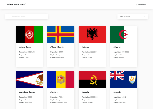
React.js single-page app

Solution retrospective
Hello everyone! This is my second exercise with React.js. This challenge gave me the opportunity to use and practice for the first time with the react-router-dom and therefore with the single-page-applications.
Any advice and feedback is welcome!
Unfortunately in the deployment I am encountering a problem that was not there during the development: in smartphone mode the select-container covers the first card of the countries.
Another problem I encountered is the fact that, in the route dedicated to country-details, if I change country by clicking on the borders button, when I click on the back button of the browser I cannot go back in the browser-history: the url changes correctly, but the UI does not change.
Thanks so much!
Please log in to post a comment
Log in with GitHubCommunity feedback
No feedback yet. Be the first to give feedback on Aurora Sirigu's solution.
Join our Discord community
Join thousands of Frontend Mentor community members taking the challenges, sharing resources, helping each other, and chatting about all things front-end!
Join our Discord