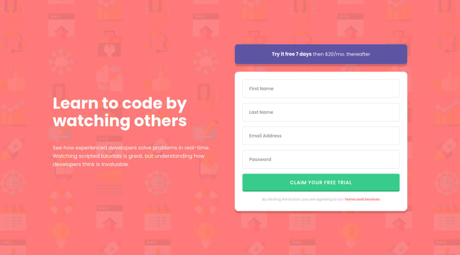
ReactJS, SCSS, TypeScript solution done on Twitch Live Coding session
Design comparison
Solution retrospective
Hi there!
I enjoyed so much this challenge. Too many things to be left done.
Maybe more animations, maybe removing the error messages while writing on the form.
Any feedback about the implementation will be much appreciated.
Next challenge -> The Junior ones!
Community feedback
- @ApplePieGiraffePosted almost 4 years ago
Hello, Carlos Loureda! 👋
Nice work on this challenge! 🙌 I like the success message that appears when the user submits the form with valid input! 👍
I suggest,
- Switching to a mobile-friendly layout sooner than 700px to prevent the content of the page from looking squished right before the layout changes.
- Getting rid of the extra white space above the password input element. 😉
Keep coding (and happy coding, too)! 😁
1@carloslouredaPosted almost 4 years ago@ApplePieGiraffe Thanks! I completely had screwed the 2 points you suggested while fixing some a11y warnings. Now it should be fixed. Thanks for the quick and nice feedback!
Happy coding!
1@ApplePieGiraffePosted almost 4 years ago@carlosloureda
Just took another look, and it looks much better now! 👍 Cheers! 🙌
1
Please log in to post a comment
Log in with GitHubJoin our Discord community
Join thousands of Frontend Mentor community members taking the challenges, sharing resources, helping each other, and chatting about all things front-end!
Join our Discord
