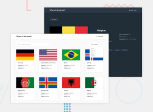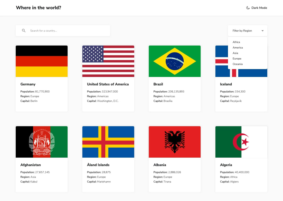
Design comparison
Solution retrospective
Made this into a PWA.
I would really like some help on how to improve the performance of the site (Lighthouse), like how to avoid excessive DOM size & make the site faster.
That, or any other advice/critique would be great, thank you!
Community feedback
- @ApplePieGiraffePosted almost 4 years ago
Hey, great work on this challenge, Diarrah! 👏
Your solution looks good and works very well! I like the animation of the "Back" button in the country details pages and the helpful error message that gets displayed when no countries matching the search input have been found. 👍 The favicon you chose matches the site, well, too!
I only suggest taking a look at your solution report (since there are quite a few errors there) and perhaps adding a hover state to the options of the region select box to the left of the page would be a nice touch! 😉
Keep coding (and happy coding, too)! 😁
0
Please log in to post a comment
Log in with GitHubJoin our Discord community
Join thousands of Frontend Mentor community members taking the challenges, sharing resources, helping each other, and chatting about all things front-end!
Join our Discord
