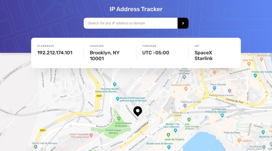
Design comparison
SolutionDesign
Community feedback
- @RioCantrePosted almost 3 years ago
Hello there! Great work with this one. Regarding the solution you submitted, I think you should know the following notes…
- Well use of the API, it only generates IP address and gives warning for incorrect input
- The
h1font can be adjusted into31pxbut it still looks good - The project is responsive and utilized details accordingly based on the original design
- The Sass file is well structured
- Remove unnecessary code to keep it clean, but overall it's readable
- Awesome job in using React in this project
Above all, The project is awesome! Keep it up!
Marked as helpful0@yousef2007-rgbPosted almost 3 years ago@RioCantre thank you very much for writing this comment and I'll work on the points you mentioned, and thanks again for motivating me :)
0
Please log in to post a comment
Log in with GitHubJoin our Discord community
Join thousands of Frontend Mentor community members taking the challenges, sharing resources, helping each other, and chatting about all things front-end!
Join our Discord
