Design comparison
Solution retrospective
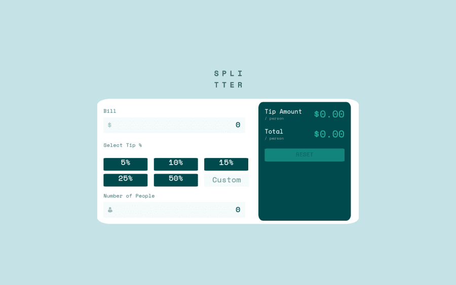
Hi everyone! I'm not this good at Front-end but I tryed my best to make it work so I hope u all like it.
Soo I would like suggestions about what I could do to improve, any tip?
Btw I used the "/ person" part in css and the answer of the errors in css too using before and after, is it a good way to do it? I was trying to improve my skills doing it.
There's a difference between the "height" value of buttons and inputs? I tryed to do the "Custom" button with the same "height" of the buttons but it didn't work.
Btw I tryed to align the text inside the button too but it didn't work very well, any advice?
Thanks everyone!
Community feedback
- @grizhlieCodesPosted over 3 years ago
Hey Nikolas,
Great questions overall. I'll try tackling them and anything else I notice.
- Height = 👿 in most cases, allow me to explain... I think where responsiveness is concerned it is best to let the content decide its' own height, the only things I usually manipulate is width, but sometimes not even that.
Let's take this button for example. I used no height, no width but it looks perfectly fine, I think you'll agree? We can change the
font-size,line-height, write different/more/less content and the button will still function perfectly well. Nothing about it is fixed except the content (text related styling). I usedfont-sizeandpaddingto create the height. The browser can do all the calculations for me, saves us time and leaves components/elements more responsive.Approach every single HTML element this way except major things like
body. Everything else can just use content + padding to create the majority of its' height and width.So to anwser your question, height does not differ for anything. Inputs/buttons work more or less the same. But it is best to leave both without any height and instead opt for the above suggestion, I think you will find that this is a more responsive and natural way of thinking for just about anything.
-
On the topic of responsiveness - avoid setting widths for most things, unless the design specifically requires it.
-
You used a more traditional approach of using
% unitsin your css grid. Whilst this is correct, you are again doing the browsers work for it, there is a simpler solution thankfully 😁:fr units.
Instead of using
grid-template-columns: repeat(2, 45%)in order to 'calculate' for the grid-gap, we can just usegrid-template-columns: repeat(2, 1fr). The browser will calculate used space (grid-gap) and it will then spread the remaining space into 2 columns, each taking 1 fraction (50%) of this remaining space.Moral of the story - fr units are the more intuitive and calculation-free way of 'doing grid'.
grid-template-rows: minmax(30px,auto) repeat(3,30px)seemed a bit complicated. Assuming you let the content dictate sizing we can just usemin-contenthere, and in some casesmax-content.
Instead of using
grid-template-rowswe can sometimes opt in forgrid-auto-rowsand let the browser do even more work for us. Assuming we styled our elements to be the correct size, assuming we have preset agapfor the rows, and perhaps added a margin-bottom to the very top (Heading) element,select tip %in this case, we can just trygrid-auto-rows: min-content;. This is actually more or less what grid does by default but at least you know this is an option now, a very useful option mind you.- If you do the above suggestions you will also find that you can remove
text-align: center;from the button. It also means that instead ofpadding-bottomyou should just usepaddingso we have spacing everywhere. Obviously I'm recommending for you to removeheight. Andjustify-content: center;does nothing outside of flex/grid so remove that as it is not able to do anything there. Your button should be sized more correctly. Feel free to sometimes add amin-widthto things though. Andmax-widthto elements likebodyor main containers that require it.
To summarise: try not using fixed units where heights and widths are concerned. Use paddings/font-sizes/line-heights and the content itself. Sprinkle in some
min/max-widthsfor some control where needed.Use fraction units for css grid, dabble in min/max-content and study what these do. A good study would be
minmax(min-content, 1fr), this is a completely responsive solution to some problems you'll find along the way.If you have any questions about the above or any other questions then feel free to ask, I'll try responding if I can 😀
Cheers,
Rafal
Marked as helpful4@NikolasMatiasPosted about 3 years ago@grizhlieCodes I'm still trying to figure out how can I do everything you said. But it's helping me a lot anyway. I still need to work a lot until I become an amazing front-end developer. But I'm sure with your advices I can do it.
1@grizhlieCodesPosted about 3 years ago@NikolasMatias Just let me know if you have any questions if you're stuck on something, I've no issues clearing anything up.
And you can become a great darn developer if you want to, it just takes time, repetition and in my opinion, an element of obsession. But that's just opinion 😅
0
Please log in to post a comment
Log in with GitHubJoin our Discord community
Join thousands of Frontend Mentor community members taking the challenges, sharing resources, helping each other, and chatting about all things front-end!
Join our Discord
