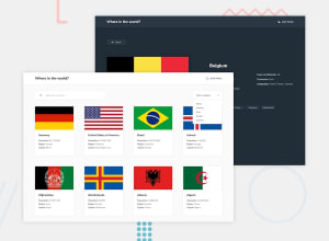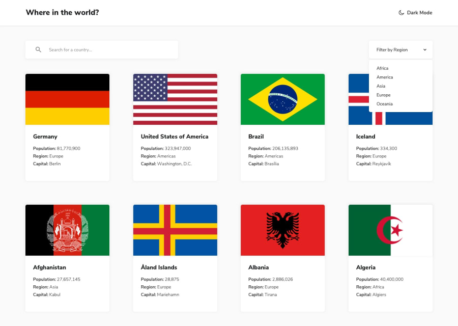
Design comparison
Solution retrospective
Hello people,
I'm very glad to finally complete this challenge. It happened to be harder than I initially expected but I'm so glad I'm able to complete it. I started with desktop screen size first but it should be fine on all screen sizes. If there's anything you think I did wrong or could have done better especially with state management in react which was my biggest headache in this challenge, please I'd really love to hear your feedback.
cheers!
Community feedback
- @KielxPosted about 3 years ago
Hi there John!
Your solution looks great with an almost pixel-perfect fit! Good job. The app works flawlessly with the only minor issue being leftover console logs that you forgot to remove from the input field and array of border countries. I took just a glance at the code and maybe I missed it, but you could consider using the Redux toolkit for your next projects to make state management a bit easier.
Overall - great job. Best wishes, keep up the good work!
1
Please log in to post a comment
Log in with GitHubJoin our Discord community
Join thousands of Frontend Mentor community members taking the challenges, sharing resources, helping each other, and chatting about all things front-end!
Join our Discord
