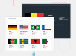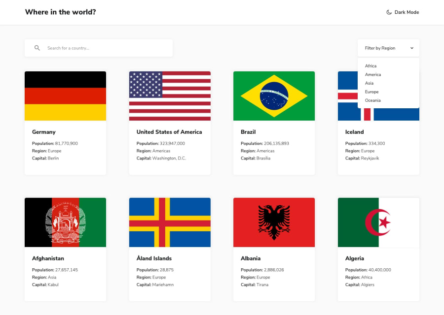
Design comparison
Solution retrospective
I need feedback on how I code and my folders structure and if there are faster ways to load my api
Community feedback
- @AlexKMarshallPosted about 3 years ago
Hey there. This looks very good on desktop. The semantics are good, and the grid is nice and responsive on the main page.
Looks like you might've missed making the individual country pages responsive. They overflow at around 900px screen width and under.
I won't comment on the Redux code as it's definitely not my area of expertise.
For my taste, there are too many nested folders. This is very much a personal preference, but when you're nesting component folders 3 or 4 levels deep that feels like overkill.
You don't have to stick to a single component per file. For example you have a
<Country/>component (that I would actually call Countries, as it's a list) and then a<SingleCountry/>component in another subfolder. But SingleCountry is only used as a child of Country. I would just define that in the same file.Personally I break my components out into reusable things like
<Box/><Stack/><Grid/><IconButton/>etc. These are usually just presentational. They can be stateful, but don't usually have business logic. Then I have a features folder for things that aren't re-usable (and are generally built out of my reusable components). It's a bit like Atomic Design (https://bradfrost.com/blog/post/atomic-web-design/) but with fewer levels.But that stuff is all completely about personal taste. And it doesn't really matter. I just don't like a deep nested folder structure as I find it hard to find things. This is another guide that's fairly close to the way I do things https://kyleshevlin.com/how-i-structure-my-react-projects
Marked as helpful2@renrasPosted about 3 years ago@AlexKMarshall yeah I've been struggling with naming my components and structuring my project. I also always forget to add media queries to my project(or just lazy which is bad). Your feedback has been really helpful to me. Thank you!
0 - @nosthrillzPosted about 3 years ago
Addressing what you were asking in terms of how to make it faster: you can try Next.js. That way, you wouldn't do any api call at run time, only at build time. And users loading your site would load data as if it was already there in the html files.
As far as the project goes, there were a couple of requirements you missed:
- heading font is too big. The designs have a smaller font
- population number is not comma-separated (in the design it is)
- individual cards with longer titles will overflow (see "United kingdom of great britain and northern ireland" at a smaller-width screen)
- the dropdown list is too spaced from its parent (at least according to the design). the space seems to be almost double that of the design-imposed one)
- in between 650 and 950 px widths, the cards are displayed as two columns on the two sides, which seems a bit odd. Suggest centering
- country details -> the border countries are not clickable
- and yes, what the previous person mentioned - the mobile layout:
- heading doesn't scale
- filter by region does not switch to column layout or wrap
- the details page is definitely not mobile friendly. This takes a lot of time and finesse and shouldn't be skipped
Marked as helpful1 - @renrasPosted about 3 years ago
Yeah I was rushing and missed out on a lot and I've been lazy to make my projects responsive. Thank you I'll know what to update next time!
0
Please log in to post a comment
Log in with GitHubJoin our Discord community
Join thousands of Frontend Mentor community members taking the challenges, sharing resources, helping each other, and chatting about all things front-end!
Join our Discord
