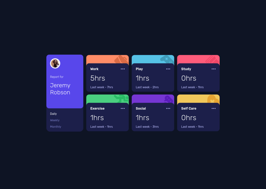
Design comparison
SolutionDesign
Solution retrospective
It was difficult to align the two cards with the first card that has double size the other cards.
I should've used grid, but i wanted to do it with flex it was a challenge for me,
I hope that I've done nothing wrong cause i feel like i could done some stuff different and better.
Overall it was a very good challenge it makes you think to use some reusable components and try to have a clean code.
also I've added a new property in the data.json provided called url it contains each icon url of each section i think it's much better this way to get the row all at once.
Community feedback
Please log in to post a comment
Log in with GitHubJoin our Discord community
Join thousands of Frontend Mentor community members taking the challenges, sharing resources, helping each other, and chatting about all things front-end!
Join our Discord
