Design comparison
Solution retrospective
Fetching the Api effortlessly
Community feedback
- @dev-paulLPosted 4 months ago
Hi 👋 Good job for your project
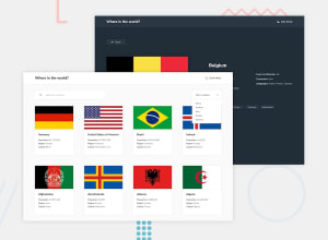
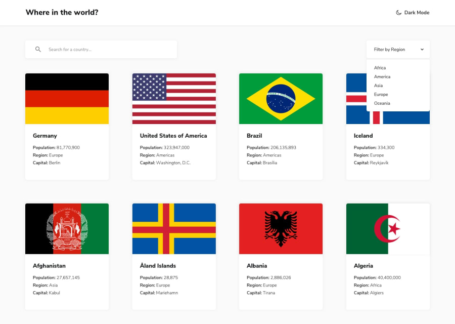
Your solution looks a lot different than the original design.
Your ThemeContext and CountryContext could be in seperate files, (usually in a context folder).
When we click on a border in the list (in the details page), it does nothing (user should be redirected to the border country details page)
Prioritize using semantic tags instead of div when you can.
Your details page can glitch and show "country not found". I recommend checking
useParams().Good luck 👍
Marked as helpful1@KaddeshPosted 4 months agoThank you for the feedback, I will make necessary modification @dev-paulL
0 - @TedJenklerPosted 4 months ago
Hi Kaddesh,
I don't agree with the previous feedback; you've done a great job. Your use of a custom select component instead of the standard <select> and <option> shows a solid understanding of frontend development. To improve, consider adding subtle animations and adjusting the width for a more refined look.
The grid needs a bit more work around the 1100px breakpoint, as it doesn't scale perfectly. Dark mode isn't fully functional yet, but you're on the right track. Great job using only context; it's impressive! However, I recommend learning Redux Toolkit for managing state in larger projects.
While semantic HTML is good for accessibility, it doesn't significantly impact SEO in client-side rendered apps like React. If SEO is important, consider using Next.js for better performance.
Keep up the great work!
Best, Teodor
Marked as helpful0@KaddeshPosted 4 months agoThank you for looking into my solution. I will make necessary correction and make the solution looks better. Big thanks @TedJenkler
1@TedJenklerPosted 4 months agoHi again @Kaddesh,
Fun to hear you like it and found it helpful! I think the Frontend Mentor site could use refresh functionality for posts and notifications, but I’m glad you liked it.
0@dev-paulLPosted 4 months ago@TedJenkler
I agree that a custom select is a good idea, but if it doesn't behave like it should (thats the case here), better use a select and option for better ux.
And using semantic tags is a good habit to have especially for bigger projects, instead of div div div div div div.
1 - @IzykGitPosted 4 months ago
Very nicely done! But remember semantic HTML still applies even in react! So make sure instead of wrapping every component in divs use elements like <main>, <section>, and <select> for the dropdown!
Keep up the good work, your code does show you know a good bit about react :)
Marked as helpful0@KaddeshPosted 4 months agoI will pay attention to this, it is almost a habit to ignore and use only div. I can see the importance now. Thanks for the comment @IzykGit
0
Please log in to post a comment
Log in with GitHubJoin our Discord community
Join thousands of Frontend Mentor community members taking the challenges, sharing resources, helping each other, and chatting about all things front-end!
Join our Discord
