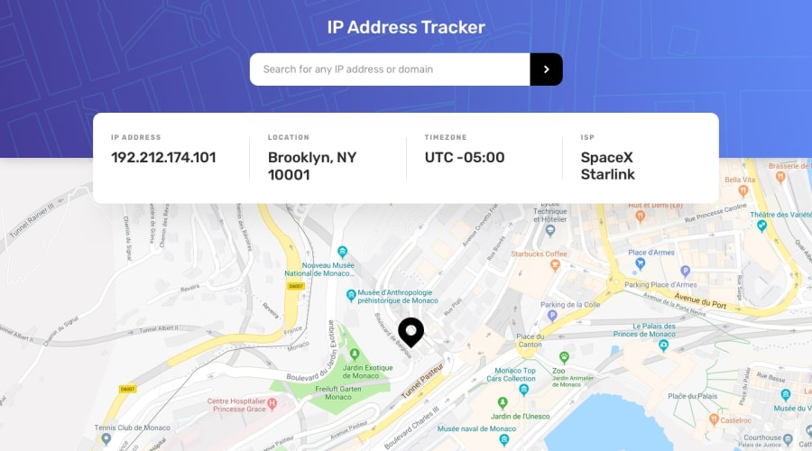
Design comparison
Solution retrospective
Hello everyone! Any feedback is welcome :)
Community feedback
- @ApplePieGiraffePosted almost 4 years ago
Hey, there, Kacper! 👋
Good work on this challenge! Your solution works rather well (apart from the search feature, as Matt mentioned) and is responsive! 👍
I just suggest taking a look at your solution report and making the input element accessible. 😉
Keep coding (and happy coding, too)! 😁
1 - @mattstuddertPosted almost 4 years ago
Hey Kacper, nice work on this challenge! You've done a good job with the styling. At the moment, I'm getting a 422 Unprocessable Entity error when I try to search for a domain. So that's worth looking into. I'd also recommend trying to resolve the accessibility error in the report.
Have you ever tried using
min-widthmedia queries instead ofmax-width? It's quite a common workflow with front-end developers to use them and work mobile-first. It can often lead to less CSS code and has the benefit of loading in fewer styles for mobile users, which can be a nice performance gain.Keep up the great work!
1 - @gacburPosted almost 4 years ago
Hello Matt, thanks for the feedback! I will look into the errors and try to fix them, I have never tried the mobile-first approach, but I must say it sounds great and very convenient, I will get into it :) Thanks for the valuable advice, I really appreciate your help!
0@mattstuddertPosted almost 4 years ago@gacbur no problem! Mobile-first will probably feel odd to start with but keep with it. It's a great workflow!
0
Please log in to post a comment
Log in with GitHubJoin our Discord community
Join thousands of Frontend Mentor community members taking the challenges, sharing resources, helping each other, and chatting about all things front-end!
Join our Discord
