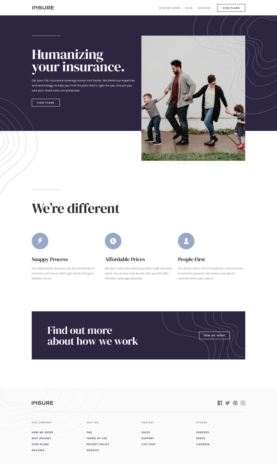
Design comparison
Solution retrospective
Any feedback welcome.
1: I'm not sure why the validation doesn't like "all: unset".
2: Couldn't find a good solution for coloring the SVG social media icons on hover.
3: The generate screenshot function in FrontEndMentor doesn't render the patterns on my backgrounds although they work fine.
Community feedback
- @RikvanderSarPosted about 3 years ago
Hi Carl,
Nice job on this challenge.
I don't know anything about React. But I've noticed two things that might be worthwhile to look at.
- The hero image doesn't grow larger as screensize gets bigger. This might not be mentioned in the challenge, but if I go a little wider then mobile width the hero and the footer don't grow / change with it. This might be a nice thing to fix with relative units and an extra breakpoint.
- The other thing is when your mobile menu is opened and then somebody enlarges the screen, you're page doesn't scroll down anymore. This problably has something to do with overflow restrictions and swithing that of in a breakpoint.
2@carlwickerPosted about 3 years ago@RikvanderSar Thanks for the feedback, disabling scroll is intentional when the mobile menu is active. I did also look into the hero image too but couldn't find a solution that didn't look and pixilated from up-scaling the image. I'll take another look at that.
0
Please log in to post a comment
Log in with GitHubJoin our Discord community
Join thousands of Frontend Mentor community members taking the challenges, sharing resources, helping each other, and chatting about all things front-end!
Join our Discord
