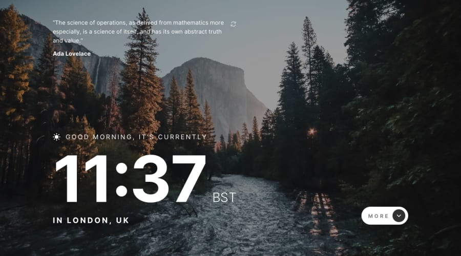
Design comparison
Solution retrospective
It’s been a fun project to work on, and I loved how the design is simple yet powerful.
this was my first time using zustand which made the state management a lot easier.
If you went through my code and you'd like to share your better approach for some of code in the repo- I'd love to learn from you 😁
Community feedback
- @sergioreynosoPosted over 2 years ago
Hi Tamir, great work in getting this far! The first thing I would recommend is you take care of accessibility issues, as they look to be very easy to fix. Second, I would recommend you add some visual, like a preloader, for when the page is loading data. I didn't go too deep into your code, but for some reason there is a delay for when the styles are rendered, I think it's related to rendering the page before api data is fully loaded.
Good luck!
0
Please log in to post a comment
Log in with GitHubJoin our Discord community
Join thousands of Frontend Mentor community members taking the challenges, sharing resources, helping each other, and chatting about all things front-end!
Join our Discord
