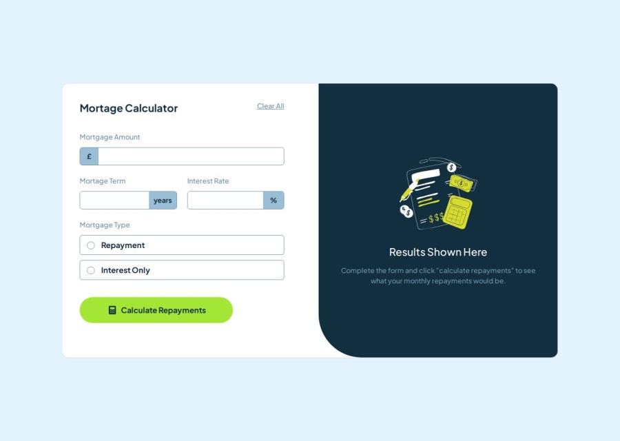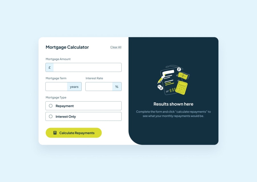
Design comparison
SolutionDesign
Community feedback
- @bartoszdudziak-devPosted 6 months ago
I see some problems with your solution.
- You should create some breakpoints to stop container from growing on screens smaller than 1200px
- Form errors are still visible even if I provide new correct values and calculate mortgage
- Labels don not work properly - most of them points to Mortgage Term input
- Clear all button could also clear the results container
Good luck! 🫡
Marked as helpful0
Please log in to post a comment
Log in with GitHubJoin our Discord community
Join thousands of Frontend Mentor community members taking the challenges, sharing resources, helping each other, and chatting about all things front-end!
Join our Discord
