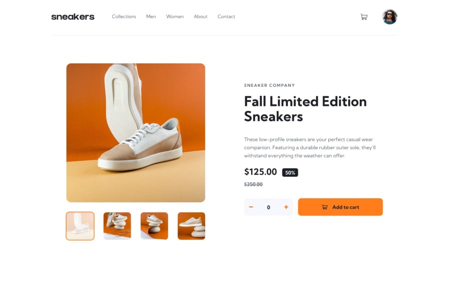
ReactJs and TailwindCSS
Design comparison
Solution retrospective
That i was able to add my items to my cart and it's working the way I was told to do
What challenges did you encounter, and how did you overcome them?when the pop out component that is showing on the desktop is not suppose to show on the mobile layout and some of the arrangement of mobile is different to the Desktop layout, it was really hard for me to get, but I keep trying and I am happy I was able to overcome it
What specific areas of your project would you like help with?i don't know yet, but if my bosses check it out and see what I need to do, please I will be glad if the feedback can come in
Community feedback
- @arshGoyalDevPosted 10 months ago
Hey, it's a great solution
few things you could improve on
- increasing padding in the header and product info would make it look better
- making the picture a bit smaller would make it more close to the design
- and as a addition clicking on checkout btn can clear the cart and showing a message like checkout complete
Marked as helpful0
Please log in to post a comment
Log in with GitHubJoin our Discord community
Join thousands of Frontend Mentor community members taking the challenges, sharing resources, helping each other, and chatting about all things front-end!
Join our Discord
