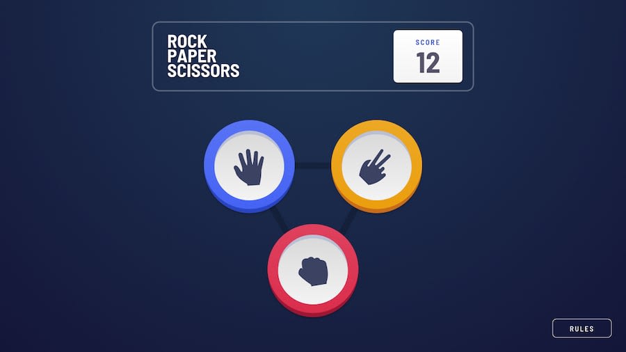
Design comparison
SolutionDesign
Solution retrospective
Nit picking.
-
Not sure how to make the background
pentagramthicker like in the design example. -
Not sure of a convenient/graceful way to transition the
open rulesbutton's position as the screen height shrinks without effecting therules modal. This happens at heights shorter than the height of therules background~750px. -
Why does my generated screenshot appear 'short'. It looks fine when I visit the site directly.
Community feedback
- @miguelseguramxPosted over 4 years ago
This is a wonderfull version of Rock, Paper, Scissors, Lizard, Spock! This is Amazasing! I love it! :3
1
Please log in to post a comment
Log in with GitHubJoin our Discord community
Join thousands of Frontend Mentor community members taking the challenges, sharing resources, helping each other, and chatting about all things front-end!
Join our Discord
