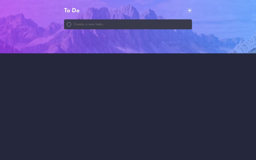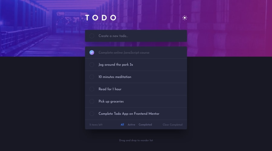
Design comparison
Solution retrospective
...
What challenges did you encounter, and how did you overcome them?...
What specific areas of your project would you like help with?Although I checked for bugs and found nothing but if you encounter any please let me know of it !
Community feedback
- @Mahmoud-ElagamyPosted 5 months ago
Awesome job on your To-Do app! Everything works as expected, and the design is clean. I noticed a few areas that could enhance the user experience:
1- Data Persistence: The app doesn’t seem to save tasks after a refresh. Adding data persistence (e.g., using localStorage) would make it even better!
2- Max-width for Container: The content container doesn’t have a max-width, which causes the width to increase on larger screens. Adding a max-width would help maintain a more consistent layout.
3- Task Count Update: After marking a task as completed, the task count doesn’t update. You might want to make sure the count reflects only active tasks or completed tasks, depending on your intended behavior.
4- Minor UI Issue: I also noticed a stray semicolon (;) showing up by mistake. Fixing this would help clean up the UI.
Great work so far, and I hope these tweaks make your app even better! Keep it up!
0
Please log in to post a comment
Log in with GitHubJoin our Discord community
Join thousands of Frontend Mentor community members taking the challenges, sharing resources, helping each other, and chatting about all things front-end!
Join our Discord
