React-based

Solution retrospective
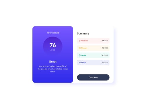
I'm really proud of widening my understanding on how react works. Although this is just a front-end page, it really solidified my knowledge on components and how to deploy a react in GitHub pages.
What challenges did you encounter, and how did you overcome them?Deploying react in GitHub pages was a nightmare. It turns out, I needed to properly reference the images' paths properly with consideration of deployment.
For a light problem, I had problems with sizing my elements based on the browser's screen resolution. I had to experiment using different measurements and style properties to achieve that. Though I'm not quite sure if my way of doing it is correct or efficient.
What specific areas of your project would you like help with?I'd like to get help with how I built my CSS styles. I'm not sure what measurement units to use on different scenarios. I tried searching for answers but I wasn't able to get a solid one as people use different types.
Please log in to post a comment
Log in with GitHubCommunity feedback
No feedback yet. Be the first to give feedback on Wafflegum's solution.
Join our Discord community
Join thousands of Frontend Mentor community members taking the challenges, sharing resources, helping each other, and chatting about all things front-end!
Join our Discord