Design comparison
SolutionDesign
Community feedback
- @EricSeallPosted 3 months ago
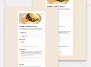
The bold parts of the instructions look a little large compared to the text following them and the card itself looks a little narrow for larger screens, but it's cool that you used your own image and font for the design! The shadow is a nice touch as well.
0
Please log in to post a comment
Log in with GitHubJoin our Discord community
Join thousands of Frontend Mentor community members taking the challenges, sharing resources, helping each other, and chatting about all things front-end!
Join our Discord
