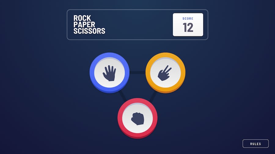
Design comparison
SolutionDesign
Solution retrospective
Hi this is my first ever try on React(just learned it by videos) I struggled a lot and searched a lot on google and youtube
I find React to be really difficult to understand but i learned a lot :)
feel free to give me some feedback
have fun
Community feedback
- @dimolf345Posted over 3 years ago
Very beautiful project! Noticed that you used React, I've done the same but with Vanilla JS.
It looks very similar to design. It's way more better than mine but I've noticed some features that you can improve so I want to share them with you:
- You should create a function that prevents the score from being negative (I've done the same mistake);
- If you compare the mobile design site with the desktop one, the heading or paragraphs "You Picked" and "The house picked" should be positioned above the button;
- The hover effect on button it's very smart and looks great (I haven't done that in mine) but you should disable it (in my opinion) when it comes to the result ("You win" or "You lose"). That's because hovering effects suggest users that they can interact with buttons, but this is not the case (at this stage of the game you can only interact with "play again" button).
Hope my comment was useful. Anyway good job! Love It!
0
Please log in to post a comment
Log in with GitHubJoin our Discord community
Join thousands of Frontend Mentor community members taking the challenges, sharing resources, helping each other, and chatting about all things front-end!
Join our Discord
