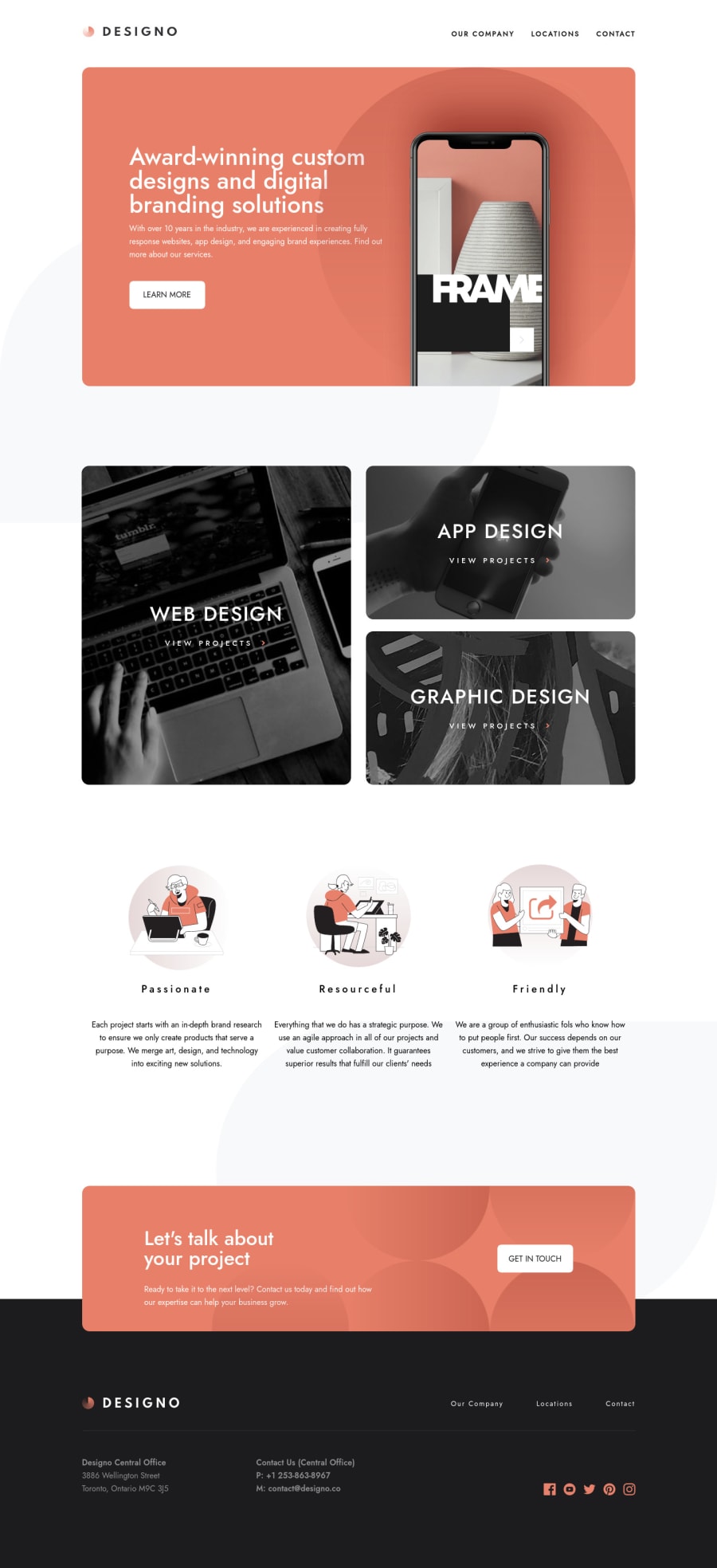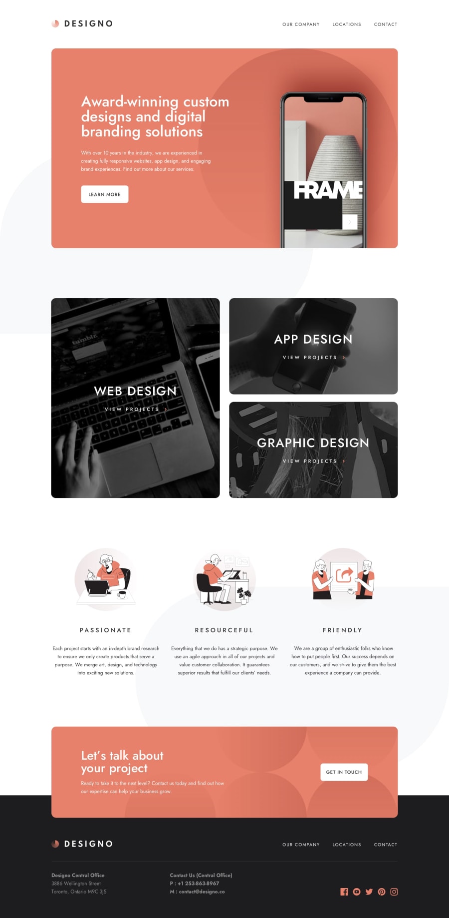
Design comparison
SolutionDesign
Solution retrospective
Desktop site is finished. Will work on mobile and tablet view. Any feedback on the desktop version would be appreciated
Community feedback
- @ApplePieGiraffePosted almost 4 years ago
Hey there, Chris Conner! 👋
Nice job on this multi-page challenge! 👏 Things in the desktop layout look pretty good! 👍
I'd like to suggest,
- Adding a max-width to the header of the page to prevent it from growing wider than the rest of the design on extra-large screens.
- Turning the navigation links and the social media icons in the footer of the page into links using the anchor tag.
And of course, as you mentioned, the next steps you could take towards improving your solution would be to make it responsive for tablet/mobile screens! 😉
Keep coding (and happy coding, too)! 😁
1
Please log in to post a comment
Log in with GitHubJoin our Discord community
Join thousands of Frontend Mentor community members taking the challenges, sharing resources, helping each other, and chatting about all things front-end!
Join our Discord
