React + Vite with plain css solution

Solution retrospective
Prior to this I have done 5 frontend mentor problems using pure css and html with some javascript when needed. I am now transitioning to React. Theres 0% chance I do 5.
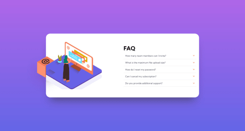
This one was a real challenge. The accordion was hard, I tried my own way of doing and... it worked! It doesn't have fancy animations, but its mine and it works so I'm happy. I hoped to learn some animations for it, but it never came to fruition. In addition, getting the mobile image to be placed on top was very difficult for me, but I got there. I was really proud of when I got that to work :). But it has a problem with the way Im doing something else :( To center the card, I am using flex with justify-content and align-items. All well and good. Except, the accordions expand and add more content, meaning that to remain centered the card expands vertically in both directions. I tried very hard to make it only expand downwards and didn't get anywhere. The only thing I found I could do was set a padding top on the main - essentially give it a fixed position but then the card is no longer centered. I tried a large padding top then centering but it centers only on the body of the container, meaning it was too low. But then because it expands upwards as well, when you open enough accordions the image goes off screen. You win some and you lose some :P I got some good practice getting the image aligned anyway.
I listed out some of the challenges I face while I was coding. This is an incomplete list, but here it is
- Getting the shadow underneath the card to look correct
- Immediate thought was box-shadow, but that doesn't seem to quite work. I believe it would be doable by having another object there as the border radius appears to be different as well.
- Overuse of flexbox
- I used flexbox pretty much everytime to try and center things. Centering things is unreasonably difficult without it tbh.
- React adding a
<div id="root">to wrap all my content had so many unintended consequences. I think this will become more natural with practice though. - Managing media queries.
- I want multiple components in multiple files to react to media queries, but;
- I dont want to have multiple sources of the size to change at
- Then media queries are riddled throughout the code
- Is it better to have a completely separate file for the media query?
- But then we get a super css file :/
- Using a var in media queries doesn't seem to work
- I want multiple components in multiple files to react to media queries, but;
- Im not sure how to make the card only expand downwards when I expand one of the accordions. In current state, when enough content is open it goes off screen (due to the image being positioned absolute and relative to the top of the card)
- It would be better to keep the top in a fixed position
Now this is not a complete solution. The desktop version's images are not working correctly. Everything else works except that. The boiling point that made me decide to shelve this challenge for now and just submit it was that I do not understand position relative vs absolute vs the others YET, and so getting those images to display correctly just doesn't seem feasible until I have a strong grasp on those concepts. Especially as one image needs to be hidden on overflow and the other needs to not. I intend to come back to do the following.
- Fix those damn images
- Animate the accordions
- Make the card expand downwards only
My next step is to learn grid and position better. They seem very important
Please log in to post a comment
Log in with GitHubCommunity feedback
No feedback yet. Be the first to give feedback on prchristie's solution.
Join our Discord community
Join thousands of Frontend Mentor community members taking the challenges, sharing resources, helping each other, and chatting about all things front-end!
Join our Discord