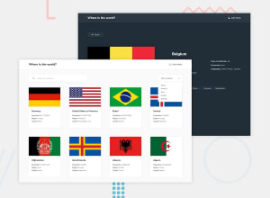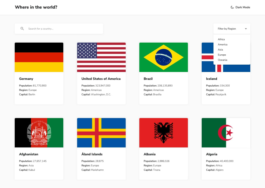
Design comparison
SolutionDesign
Solution retrospective
What are you most proud of, and what would you do differently next time?
I am very proud of the search and filter functions. I think I would have changed the styling on the focused state
What challenges did you encounter, and how did you overcome them?Getting the search bar to display the flags and options as you type did puzzle me a bit bt luckily material UI makes it so easy
What specific areas of your project would you like help with?Any Feedback is welcome
Community feedback
Please log in to post a comment
Log in with GitHubJoin our Discord community
Join thousands of Frontend Mentor community members taking the challenges, sharing resources, helping each other, and chatting about all things front-end!
Join our Discord
