
Submitted over 1 year ago
React, TypeScript, SCSS, SCSS Module, Responsive

@Zukicode

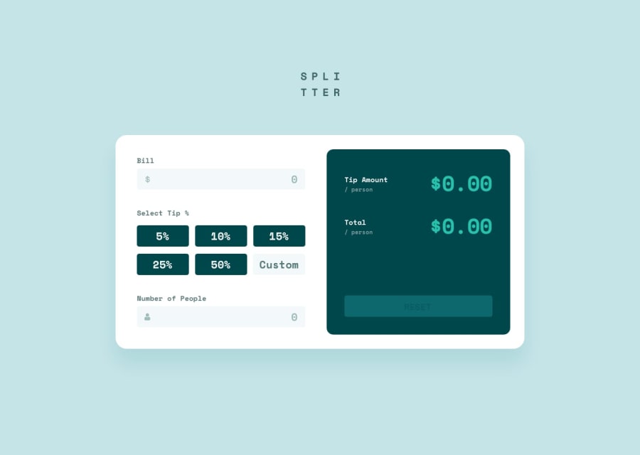
Design comparison
SolutionDesign
Solution retrospective
I enjoyed doing this project, it improved my ability to compile useState with TypeScript. I also gained a better understanding of typing in TypeScript
Community feedback
- @MikeBeloborodovPosted over 1 year ago
Look at your app in devtools and choose Iphone 5 with landscape mode, it kinda breaks. Maybe because you set your height in pixels and % here:
.content {
width: 100%;
max-width: 800px;
height: 375px;
padding: 25px;
display: flex;
align-items: center;
justify-content: center;
gap: 20px;
background-color: var(--white);
border-radius: 20px;

@media (max-width: 768px) {
width: 400px;
height: 100%;
flex-direction: column;
}

@media (max-width: 420px) {
width: 300px;
}

@media (max-width: 300px) {
width: 270px;
}
}
Try to use 100vh. Good luck!
Marked as helpful0

Please log in to post a comment
Log in with GitHub
Join our Discord community
Join thousands of Frontend Mentor community members taking the challenges, sharing resources, helping each other, and chatting about all things front-end!
Join our Discord