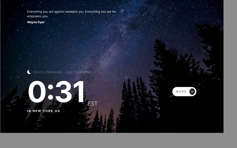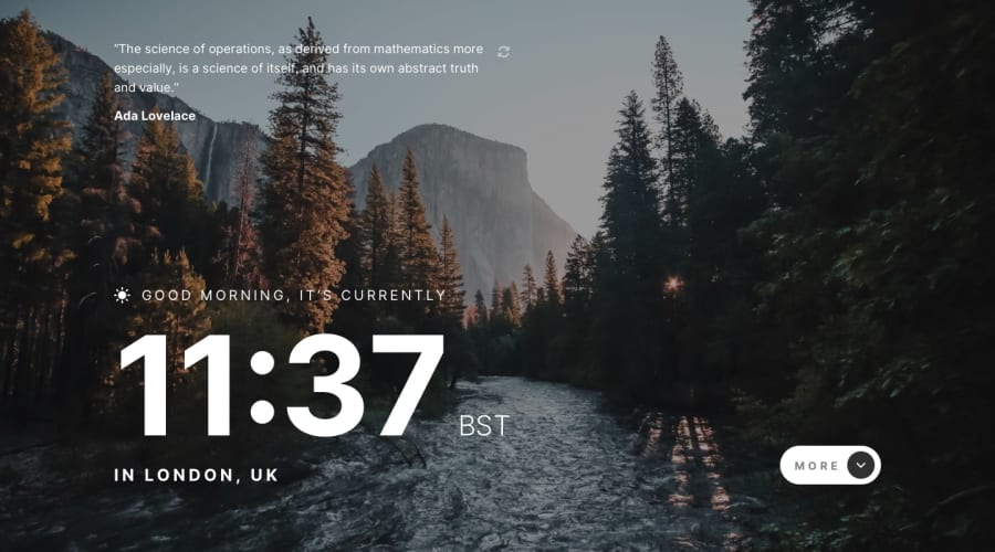
Design comparison
SolutionDesign
Solution retrospective
Feedback is always welcome
Really struggled with the background within sizes any tips to setting the background properly?
Community feedback
- @0xabdulkhaliqPosted over 1 year ago
Hello there 👋. Congratulations on successfully completing the challenge! 🎉
- I have other recommendations regarding your code that I believe will be of great interest to you.
HTML 🏷️:
- This solution generates accessibility error reports due to
non-semanticmarkup
- So fix it by replacing the
<div id="root">with semantic element<main>to improve accessibility and organization of your page.
- What is meant by landmark elements ?, They used to define major sections of your page instead of relying on generic elements like
<div>or<span>.
- They convey the structure of your page. For example, the
<main>element should include all content directly related to the page's main idea, so there should only be one per page
I hope you find it helpful ! 😄 Above all, the solution you submitted is great
Happy coding!
0
Please log in to post a comment
Log in with GitHubJoin our Discord community
Join thousands of Frontend Mentor community members taking the challenges, sharing resources, helping each other, and chatting about all things front-end!
Join our Discord
