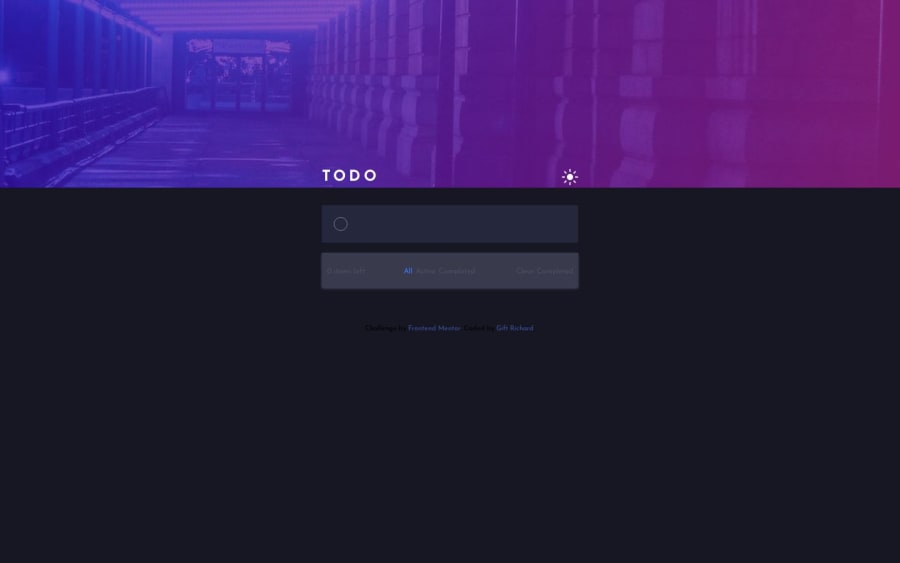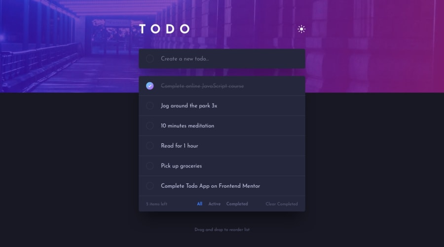
react todo list with dark and light toggle
Design comparison
Solution retrospective
I'm really proud of how my todo app turned out! 🥳 Building it from scratch using React was a fun challenge that helped me level up my skills. 💪
I think the overall user experience is smooth - the interactivity feels natural and the responsive design works well on all device sizes. 📱 The light/dark theme toggle is a nice touch too! 🌞🌛
Looking at my code, I'm happy with how I organized the components and maintained separation of concerns. 👌 Splitting the CSS into modular files also kept things tidy. 🧹
I found managing state for the filters a bit tedious, so exploring hooks like useReducer could help simplify that code. 🤓 And I'm intrigued by TypeScript - static typing seems like a helpful addition for catching bugs as the app grows. 🐞
All in all, this challenged me to sharpen my React skills and taught me a ton about best practices. 🧠 I'm feeling motivated to keep learning and build more ambitious projects. ✨ The key is staying curious, taking feedback constructively, and not being afraid to make mistakes along the way. 🤝
I'd love any feedback from other devs on where I can improve. 🙋♂️ And if anyone has project ideas or wants to collaborate, I'm open to that too! 🤝 Still lots more to learn but feeling energized by the progress I've made so far. Onward! ✨
Community feedback
Please log in to post a comment
Log in with GitHubJoin our Discord community
Join thousands of Frontend Mentor community members taking the challenges, sharing resources, helping each other, and chatting about all things front-end!
Join our Discord
