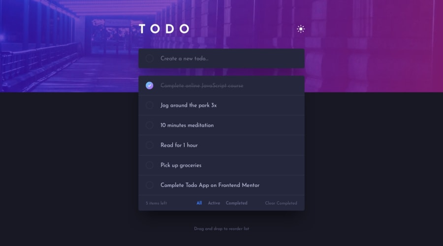
Design comparison
Solution retrospective
Any feedback would be much appreciated
Community feedback
- @visualdennissPosted over 1 year ago
Hey there,
good work. I'd suggest not using position absolute, especially top:29%, since it can cause problems with the layout when the browser size changes. E.g. I'm viewing this on a larger screen and when i first opened the page, the todo list was covering the TODO header already.
.todolist { margin-bottom: 100px; position: absolute; top: 29%; z-index: 1; }
If you remove all those position absolutes from header, list and the drag-drop text, and remove the height: 100% from the todo list, it should pretty much fix the issue.
Hope you find this feedback helpful!
Marked as helpful0
Please log in to post a comment
Log in with GitHubJoin our Discord community
Join thousands of Frontend Mentor community members taking the challenges, sharing resources, helping each other, and chatting about all things front-end!
Join our Discord
