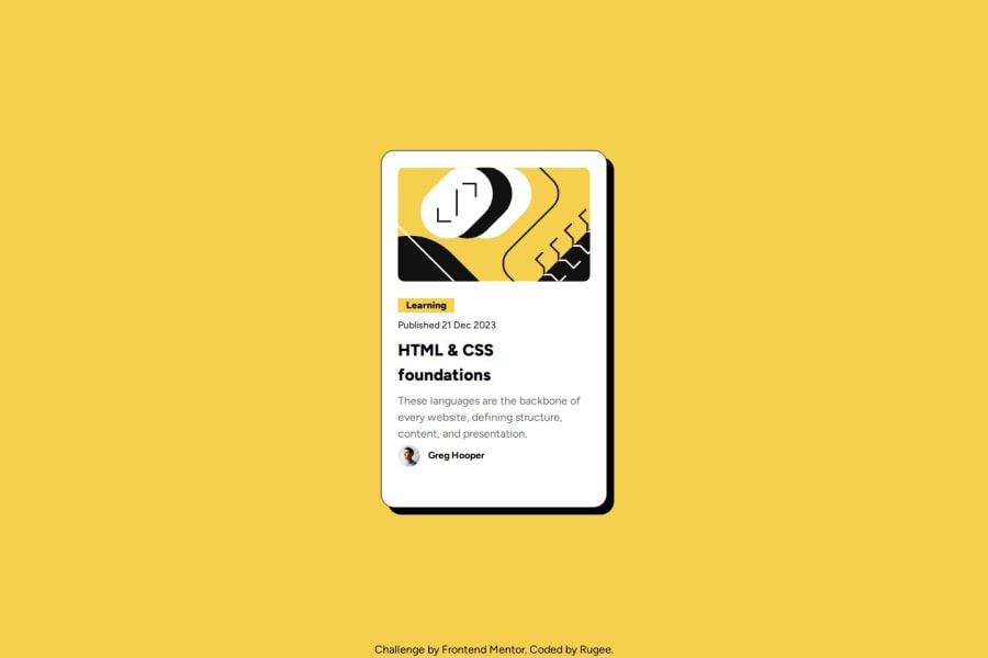
Design comparison
SolutionDesign
Community feedback
- P@ericssonmuraPosted 5 months ago
Hi there. 👋 Good job!
I loved your box-shadow + text effect when hovering over the box.
I see you used React to achieve the project.
Some suggestions :
-
You didn't make the font responsive : it needs to be smaller on mobile devices, as mentioned in the readme file;
-
The image 'illustration-article' must be the same size in desktop and mobile mode.
Cheers and keep coding!
0 -
Please log in to post a comment
Log in with GitHubJoin our Discord community
Join thousands of Frontend Mentor community members taking the challenges, sharing resources, helping each other, and chatting about all things front-end!
Join our Discord
