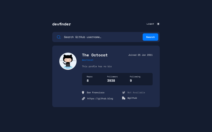
Design comparison
Solution retrospective
I really enjoyed working with APIs for the first time in a few years as well as learning how to implement a light/dark mode using tailwind.
Two things I am kinda of stuck on but it may be a bit niche. I used the react-aria search field from Adobe to create my search bar however I notice that when I have my error message appear there seems to be an 'x' clear button when the search bar is in focus and I am unsure how to get rid of that clear 'x' button.
The second issue I encountered and am unsure how to fix is if you type a user name and it throws the error the error will be removed if you hit 'Escape' or the clear 'x' button, however, if you ctrl-a or backspace or even just use the keyboard to go fix the error and then the user info is pulled up, the error message still persists.
Any advice on how to fix either or any other bugs I haven't encountered would be greatly appreciated.
Overall I really enjoyed this project a ton and cannot wait to work with more APIs going forward. 😃
Community feedback
Please log in to post a comment
Log in with GitHubJoin our Discord community
Join thousands of Frontend Mentor community members taking the challenges, sharing resources, helping each other, and chatting about all things front-end!
Join our Discord
