Submitted over 3 years agoA solution to the Interactive card details form challenge
React, Tailwind CSS
react, tailwind-css
@Saga-sanga

Solution retrospective
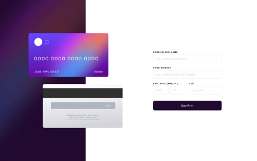
Hi, everyone this is my solution for the challenge. A few questions I'd like to ask: How do I better handle responsive design of the card graphics and all the elements within? Handling font sizes with tailwind-css has been quite difficult for me. I've also used bg-image for the graphics. Is there any better way to do this?
Code
Loading...
Please log in to post a comment
Log in with GitHubCommunity feedback
No feedback yet. Be the first to give feedback on Reckson Zirsangzela Khiangte's solution.
Join our Discord community
Join thousands of Frontend Mentor community members taking the challenges, sharing resources, helping each other, and chatting about all things front-end!
Join our Discord