Design comparison
Solution retrospective
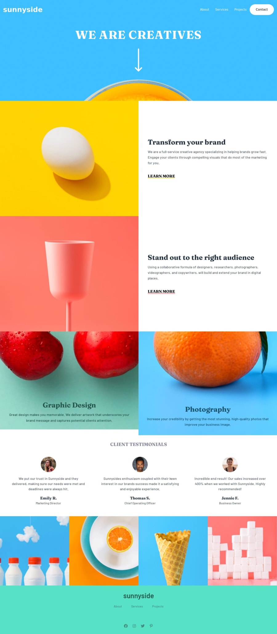
Had issues with the photography and orange image and the transform your brand part to reverse the flow of the content. Any insight will really be appreciated.
Community feedback
- @adityaphasuPosted over 1 year ago
Hi! Good job completing the challenge!🙌🏻
- Since you are using tailwind add this to the transform content container div:
<div class="lg:row-1 lg:col-1"> //content </div>-
This makes sure that the transform text div will take the 1st column and the 1st row of the grid on large screens and the img div will automatically move to the 2nd coulmn.
-
As for the photography and graphic containers its quite easy to fix, give both the text containers a class of
h-fulland that would make them take the full height (100%) of the containing div like this:
<div className=""> <div className="h-full"> //Here <h1 className=""> Graphic Design </h1> <p className=""> Great design makes you memorable. We deliver artwork that underscores your brand message and captures potential clients attention. </p> </div> </div> // orange div </div>- I have removed the other classes in the snippet so that its easy to understand as to which div to put the class to.
- Do the same for the orange div and you'll be good to go!
Happy coding!🕺🏻
Marked as helpful0 - @Aimal-125Posted over 1 year ago
In your css code, increase the height of 120 or 150vh by using media query with
max-height: 400px;so that your web app looks good on small heighted screens as mine samsung j3.Marked as helpful0@AbieroAlvinPosted over 1 year ago@Aimal-125 Thanks for the insights let me try to implement it.
0
Please log in to post a comment
Log in with GitHubJoin our Discord community
Join thousands of Frontend Mentor community members taking the challenges, sharing resources, helping each other, and chatting about all things front-end!
Join our Discord
