React, Styled-Components, React-Router, Material-UI and AOS
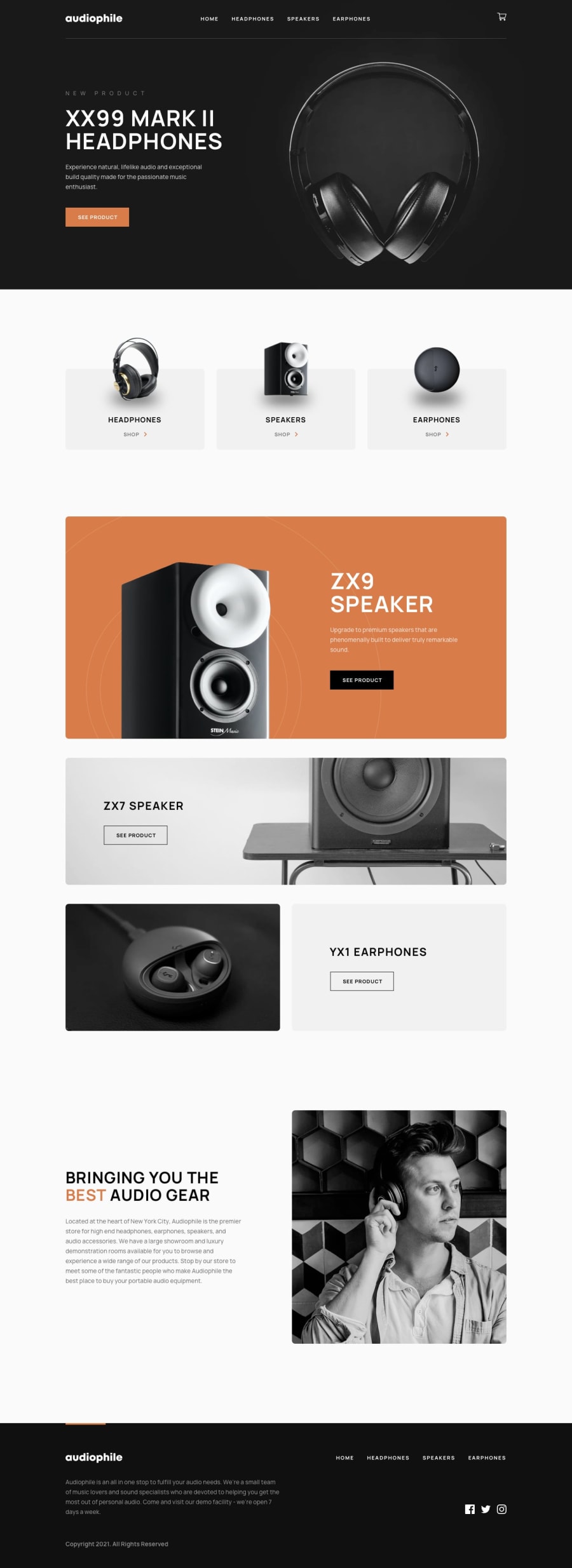
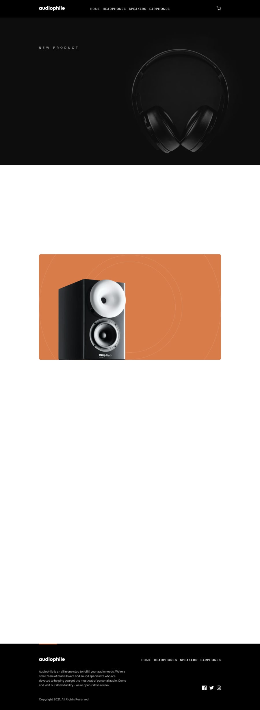
Design comparison
Solution retrospective
Also used react-hook-form. First time using most of the libraries, struggled a bit with the logic of cart like updating the quantity of a product. Any feedback would be appreciated
Community feedback
- @pikapikamartPosted about 3 years ago
Hey, awesome work on this. The layout looks really good in desktop, the responsiveness is great, but the breakpoint for mobile layout is too early, I am at 1200px I think and the mobile layout already showed. Toning it down would be good.
I looked into your repo but you didn't push the development codes:<. It would be great to include those so that we could also see how you made use of js or react.
Some suggestions would be:
- The navbar should be include in a
header
element. This will create more structure in your website. - Also, I would separate both the website logo link and the cart from the 4 links in the middle. The reason is that, if I navigate in your
header
landmark, and go in the cart, screen reader will still announce that I am innavigation
which should not be, because the cart is just dropdown and not a link. That is why I would structure it this way:
<header> <div> <a><img /></a> # company logo </div> <nav> <ul> { use ul on the list because those are list of links, it would be much accessible } </ul> </nav> <div> { cart goes in here } </div> </header>
As you can see, nesting a list of links inside a
ul
element, makes a screen reader user know how many links are there because screen reader announces how many items are there inside a list.- Your ordering as well is incorrect in the supposed
header
. If you tab, you are first on the company logo then tab again, you will go in the cart which should not be. Your html ordering must be revised. - The company logo must use
aria-label="homepage"
on thea
tag that wraps it, so that users will know where this link would take them. alt
of the company logo should bealt="audiophile"
. The image already has the text, better to use it. Also, do not use words that relates to "graphic" like "icon, logo, image, picture" as a value in thealt
attribute.button
for the cart should havearia-label
as well asaria-expanded
attribute.
<button aria-label="cart dropdown" aria-expanded="false"> # update aria-expanded if the button is triggered. <img alt=""/> # the alt should be empty, it is decorative image </ button>
- Adding as well a
cursor: pointer
to the desktop layout in the cartbutton
. - Toggling the cart dropdown, as a keyboard user, they can't close the modal. You should add a custom close
button
witharia-label="close card dropdowb"
on it, so that the user could close the modal. - The navbar links as well should have a
aria-current
attribute on them. If for example, I am at the homepage, thehome
link should havearia-current="page"
to inform a user that they are in the home page. - Have a
main
element. This creates more structure:
<header /> <main /> <footer />
- I saw that you are using
height: vh
. Avoid using this because it is limited to the viewport's height and will shift very much to every user. Userem
unit on theheight
or maybe you don't need to addheight
let the content fill it up and just add somepadding
that will make the section more consistent. - Do not nest
button
inside ana
tag. This just create one more tab key press. If you try tabbing on it, you will need to tab twice to get out of the focus. - The product links after the hero section needs to toggle the
aria-current
as well on the navlinks.
FOOTER
- Website logo
a
tag needsaria-label="homepage"
. - Website logo
img
needsalt="audiophile"
. Lose the "logo" word. - The links as well could have used
ul
element on this one. Along with thearia-current
attribute being applied if they are at that link. - Social media link
a
tag needs to havearia-label
likearia-label="facebook"
on thea
tag that holds the facebook icon. - You could use
aria-hidden="true"
on thesvg
if you want to hide it, or add atitle="name of the social media"
if you want thesvg
to be visible in screen readers. - Now, when clicking on the footer links, the window goes up right, visually where are in there, but, the focus is currently still on the footer link. If you test it, try using tab key to choose a link on the footer, normally if you tab again, you will navigate on the page right, on the loaded page, but, on your case, tabbing again will just navigate you in the next link. Since you are using react, you need to manually adjust the focus on the page that the user navigated.
What I would on this one is that, I would add
tabindex="-1"
on themain
page of the selected link. I would useuseRef
to target themain
element. Now, on componentDidMount. I will transition the focus on the ref element.useEffect(() =>{ refElement.current.focus(); }, [])
This way, the focus will be changed and keyboard functionality as well as screen reader will know where they are at. Just remember to add
outline: none
to the element that will be theref
element, so that it won't get anyoutline
since the focus will be on them.- On the addition or subtraction of item, it would be great to have
aria-live
element which say how many items are there now in my selection. - On the cart, it would be great as well to have
aria-live
again to announce that when the user clicks remove all, the items are removed.
OTHER PAGE
- The
checkout
page should havemain
landmark, this makes screen reader users knows where they are at, since there is a heading tag that will be read, if the user navigated through it. Using landmark elements is very very useful and really needed to properly know what the content overview is all about. - On the form checkout, the error message visually is seen, but screen reader users won't know the error. Adding a
aria-live
element that announces whether the user submitted a wrong information. Also, those error message should haveid
and that id will be used by theinput
element as the value in thearia-describedBy
along with thearia-invalid
if the input is wrong. A pseudo code will be:
const input = query the input; if ( input is invalid) { input.setAttribute("aria-invalid", "true"); input.setAttribute("aria-describedBy", put the id of the error message element); } else { input.removeAttribute("aria-invalid"); input.removeAttribute("aria-describedBy"); } Remember to show the error
This way, screen reader users will know what error they have, because the error message is now associated with the
input
element and it will say the error message. Unlike before, there will be no info for users that they have an error.Also it is getting too long hehehe. But almost suggestions were accessibility. I haven't checked the mobile layout. I hope someone would check that one out.
Still, you did a really really great job on this. This is a hard challenge, if I could tackle it. Great work. Also, remember to push the dev codes as well on the repo.
Marked as helpful0@AyanorIIPosted about 3 years ago@pikamart Hey, thank you for the feedback. Wow, there is a lot of things to improve hehe. I didn't know about these aria attributes, I need to improve the semantics as well. Really appreciate the feedback
0 - The navbar should be include in a
Please log in to post a comment
Log in with GitHubJoin our Discord community
Join thousands of Frontend Mentor community members taking the challenges, sharing resources, helping each other, and chatting about all things front-end!
Join our Discord