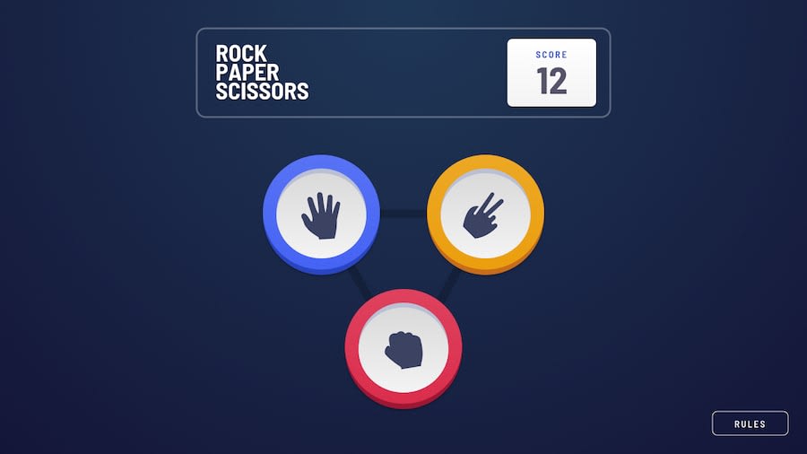
Design comparison
Solution retrospective
It was a bit weird to have to emulate the steps. Nonetheless, it works and now I just have to refactor the code for clarity
Community feedback
- @MojtabaMosaviPosted almost 3 years ago
Take A look at the following:
-
The points do not update properly, when the house wins the player doesn't lose any point.
-
It would be nice if you maintain the state of the game using local storage so if the player refreshes points don't get lost.
-
Guding the user with clear communication is great thing to do but cost is redundency I woundn't do it, Im modal the picture clearly illustrates rules for which game are displayed. If you are doing for accessibility consider hidding it visually using a helper class.
-
A hover state on button would improve the UX because it makes it more interactive.
-
The button that are on the reuslt section have slightly different styles for instance the inner and outer box-shadows are a bit thicker.
-
More natural trasitions also improve the UX, to clarify this think about how changes happen in the natural world that we live in are they sudden and spantaneaous or slow and gradual ? for example the way paly again button enters the page does not feel natural, it just suddenly appears as oppose to gradually appearing.
-
Since the buttons don't have any text, alternative text should be provided for assistive technologies, it can simply be do be aria-label attribute
Keep coding :=)
1@nosthrillzPosted almost 3 years ago@MojtabaMosavi Hey, thanks a lot for the feedback. A few thoughts:
-
Why would you lose points if the house wins? Is the purpose of the game to be at 0 (which will statistically happen)?
-
local storage is the next thing to implement, I just didn't have time for it :D (mentioned in the repo's README)
-
I'm not sure what you mean here, could you please clarify?
-
I'm unsure what you mean... every button has a hover state
-
the buttons are different between the first step and all the others. Without Figma, that's what it seemed like to me from the provided screenshots.
-
Agree, I wanna work on that :D
-
Whoops! I should study some a11y, tbh
Thank you!
0@MojtabaMosaviPosted almost 3 years ago@nosthrillz
-
About the point, that you view on it but I think the house is suppose to simulate a real player who play against you and in order to keep count on how many time each of has won or lost, simple arithmetic.
-
Exucse the unclarity in what I meant but let's have another go at it, a button by default has limited interactive behavior, what I meant is perhaps you go amplify that by adding some sort of interactive hover state to the game buttons.
Hope it helps :=)
0@nosthrillzPosted almost 3 years ago@MojtabaMosavi Thanks for getting back, M!
I get your point about the game. Had I built it from scratch, I would have created two scores to keep track (human vs computer). But the designs never showed a -1, so naturally I kept to the specs.
As for the buttons, I'm confused simply because all my buttons have hover states. Rules gets a rgba on hover, play again gets a color change, and the circles get some depth on the colored rings on hover (which was not easy).
0 -
- @anoshaahmedPosted almost 3 years ago
To avoid accessibility issues in the future:
- wrap everything in your body in
<main>OR giverole=""to the direct children of your<body>... Click here to read more - have at least one
<h1>in your code
Good job! :)
0 - wrap everything in your body in
Please log in to post a comment
Log in with GitHubJoin our Discord community
Join thousands of Frontend Mentor community members taking the challenges, sharing resources, helping each other, and chatting about all things front-end!
Join our Discord
