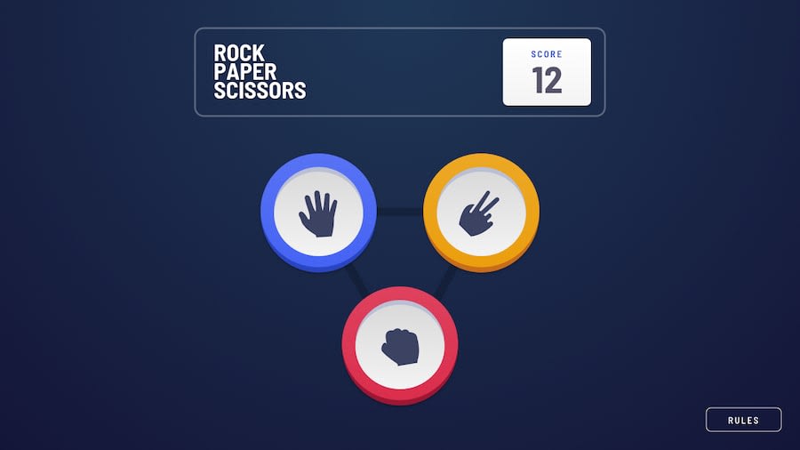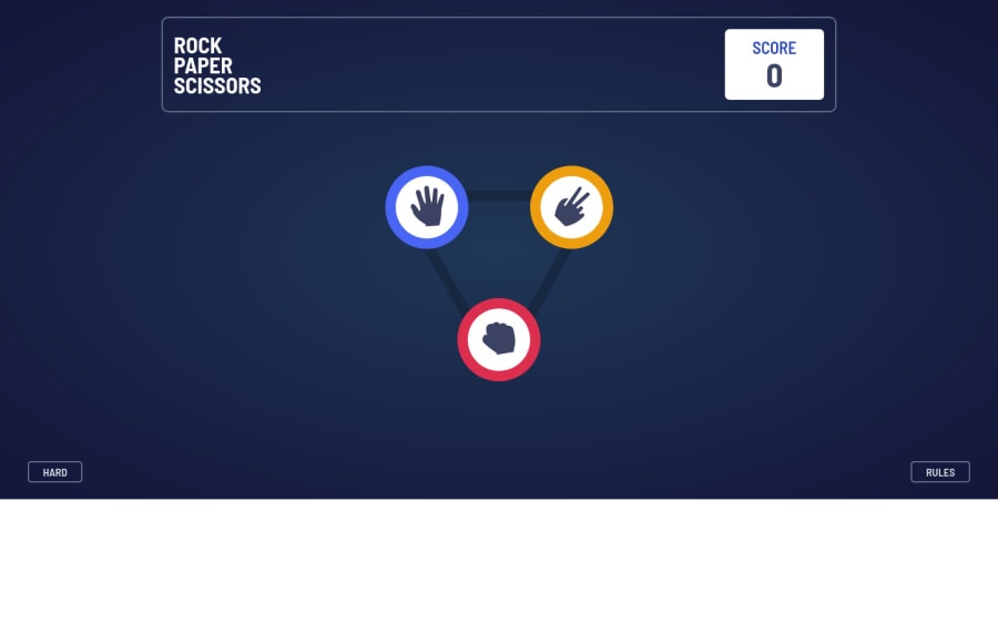
Design comparison
Solution retrospective
Any feedback is welcome. Love to hear some criticism.
Community feedback
- @JT1974Posted over 2 years ago
Hey Karthik, I'm sorry I was probably not clear enough with those 2 buttons... 🙃 I didn't mean the RULES and the EASY/HARD buttons you have at the bottom of the page. Those are cool.
What I meant was that after the player chose a hand (scissor, paper, etc.), you had the player and computer buttons slide in to the center of the screen. Your intentions were to hide both the player's and the computer's choice at the left and right of the screen, outside of the screen, however on large screens (like an iMac) the buttons are still inside the screen (because it's that wide), so I could see them before they slid in.
Again, it's really not a big issue, I don't think you should worry about it, just wanted to clarify that. Congrats, it's a nice solution! 🤓
1@karthik2265Posted over 2 years ago@JT1974 cool, got it now. I am using a 13 inch ideapad so I have missed it. Will keep these things in mind for next project.
Thanks
0@karthik2265Posted over 2 years ago@JT1974 cool, got it now. I am using a 13 inch ideapad so I have missed it. Will keep these things in mind for next project.
Thanks
0 - @JT1974Posted over 2 years ago
Hi Karthik,
I'm on iMac and it looks a bit strange, that I can see the 2 buttons before they slide in to the center. On smaller screens it looks ok, so I think it's not a big deal (anyway the target display was 1366px wide), but other than that it looks good! You even solved both the 3 and 5 button versions which were both well done. Congratulations!
1@karthik2265Posted over 2 years ago@JT1974 the 2 buttons you were talking about are the difficulty i.e easy/hard and rules buttons right, that was intentional, the user can refer to the rules and switch difficulty based on the result.
Thanks for the feedback.
0 - @dusanlukic404Posted over 2 years ago
Hi Karthik,
Take a look on score part. Every game I won, I got -1 points which should not be correct.
1@karthik2265Posted over 2 years ago@dusanlukic404 yes, I have fixed it now take a look here: https://rock-paper-scissor-game-taupe.vercel.app/
Thank You
0
Please log in to post a comment
Log in with GitHubJoin our Discord community
Join thousands of Frontend Mentor community members taking the challenges, sharing resources, helping each other, and chatting about all things front-end!
Join our Discord