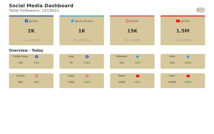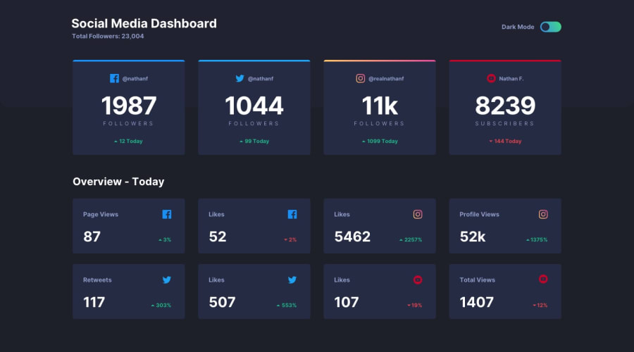
Design comparison
Solution retrospective
I had made this project months ago but never submitted and I revisited it today and changed a few things on the css, there is a lot of refactoring to do
Community feedback
- @SzymonRojekPosted almost 4 years ago
Hi Zuzki
Well done!
I have seen your project and you have added a very nice bunch of stuff, especially the border is really good. Anyway, definitely you can work with RWD because there is a huge gap between mobiles and desktop, also play around with the margin, padding, text on mobiles, positioning items in the boxes, maybe add a nice smooth :hover to each box - to be honest not much left to do. Try to fix the HTML issue report.
Ps. don't forget to upvote any comments on here that you find helpful.
Many greetings :D
4@LuisDGraciaPosted almost 4 years ago@SzymonRojek Thanks for the comment, I've been Improving thanks to all the feedback I received here!
I 've been checking for the html issue, but I think it's from the font awesome library.
0
Please log in to post a comment
Log in with GitHubJoin our Discord community
Join thousands of Frontend Mentor community members taking the challenges, sharing resources, helping each other, and chatting about all things front-end!
Join our Discord
