React Social Media Dashboard with Theme Switcher
Design comparison
Solution retrospective
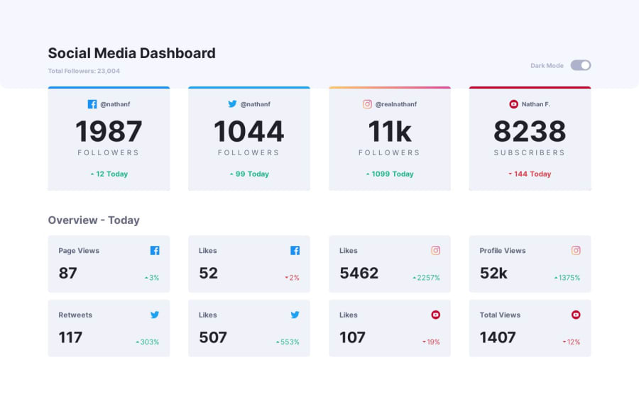
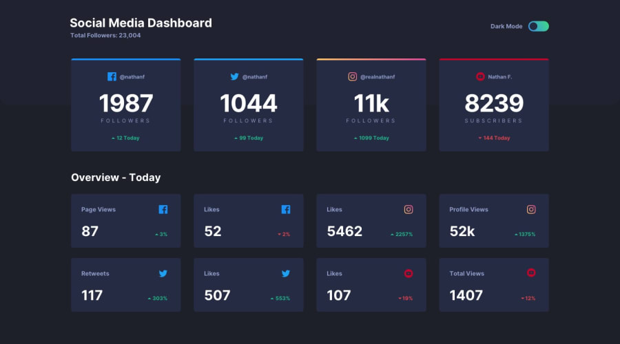
Hi everyone! I built this project with React so I could practice working with state. The darkmode toggle uses state to switch modes, and I added a Json file so I could practice working with data with the other elements of the page. I also tried to make this project accessible by using an invisible checkbox as the darkmode toggle. Any feedback is appreciated! :)
Community feedback
- @Abed001Posted 11 months ago
Nice work on this challenge! 🙌 Your solution looks great and responds nicely! 👍
A suggestion I have is, when I viewed the project on the big screen I wasn't able to see the navbar. I think if you tried padding or margin it might work.
0
Please log in to post a comment
Log in with GitHubJoin our Discord community
Join thousands of Frontend Mentor community members taking the challenges, sharing resources, helping each other, and chatting about all things front-end!
Join our Discord
