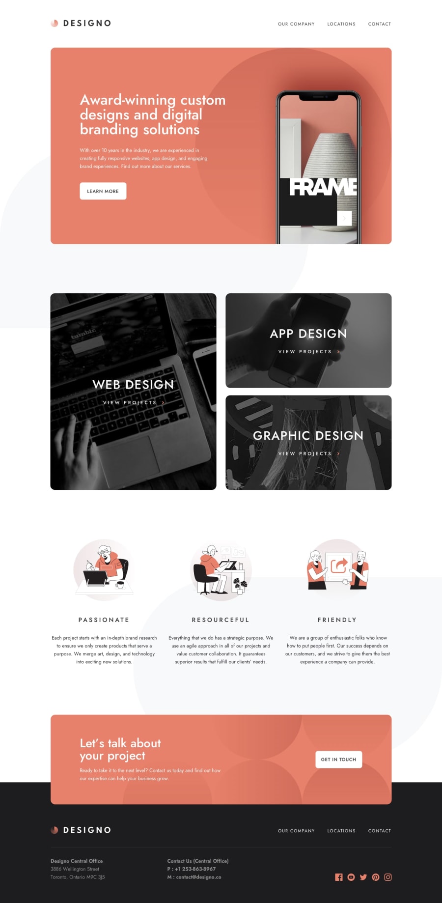
Design comparison
SolutionDesign
Solution retrospective
This is the first project I'm proud to show off in my portfolio, however, I'm unsure about my code quality/style as I've never had it reviewed and I tend to just go with whatever works. I was wondering if there are any improvements I can make in regards to that? Anything else I can improve on?
Community feedback
- @MarkoNikolajevicPosted over 3 years ago
Hi BBrownley congrats on finishing this challenge! You did a really good work on it.
I've just a few suggestions for you
- you
footer-topelement is not styled properly on mobile view, I think because you set a fixed width on child elements - I noticed the urls have the # on them as
https://bbrownley.github.io/designo/#/about - check out the report for accessibility and html issue and try to fix them
A part of these feebacks, you did a good job especially adding maps for locations.
Keep on coding and have fun! :)
1@BBrownleyPosted over 3 years ago@MarkoNikolajevic Thanks for the feedback! I really appreciate it
0 - you
Please log in to post a comment
Log in with GitHubJoin our Discord community
Join thousands of Frontend Mentor community members taking the challenges, sharing resources, helping each other, and chatting about all things front-end!
Join our Discord
