Design comparison
Solution retrospective
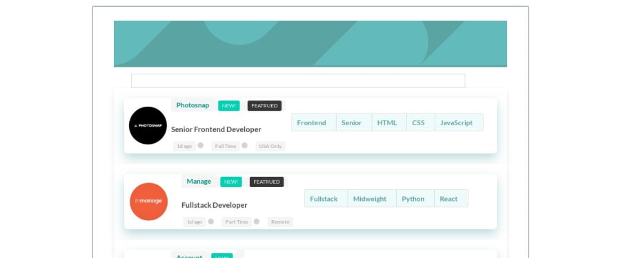
The buttons on the RHS for filtering could not be right aligned inspite of my best efforts. Any pointers for the same would be much appreciated.
Community feedback
- @rfilenkoPosted over 4 years ago
Hey, I see a lot of issues, definately needs more work on details. Also there is an error with main.css file - check the correct path. And you have included - bulma, semantic and your custom css file, do you really need them?
Advice for you - don't use so many selectors to targer el with css - .wrapper .card .card-content .parts #logo img, it's hard to maintain and overwrite styles. You can check mine solution for some inspiration.
Cheers, Roman
0@venky4cPosted over 4 years ago@rfilenko , thanks for the detailed feedback. I started off with Bulma and I could not get the desired UI so I switched to regular SASS. I will be more careful with using selectors going forward.
0
Please log in to post a comment
Log in with GitHubJoin our Discord community
Join thousands of Frontend Mentor community members taking the challenges, sharing resources, helping each other, and chatting about all things front-end!
Join our Discord
