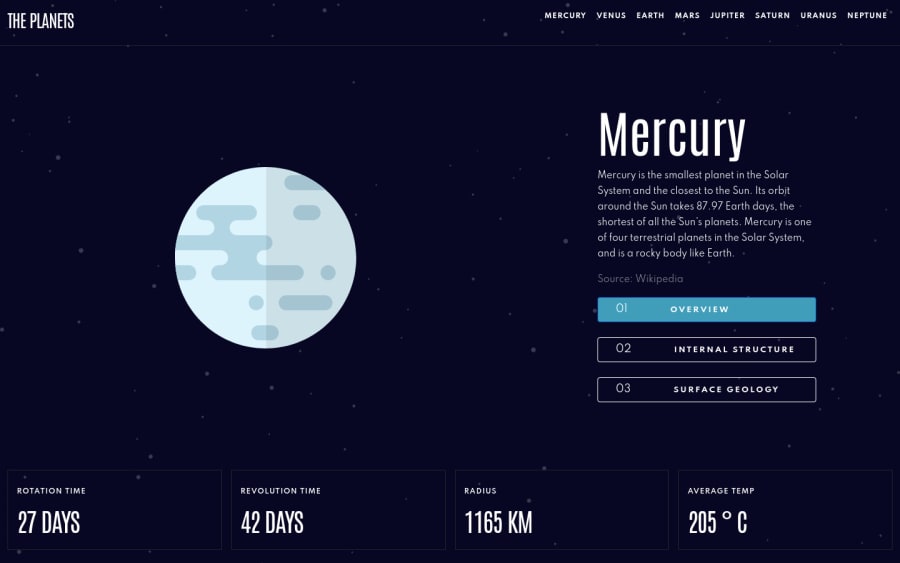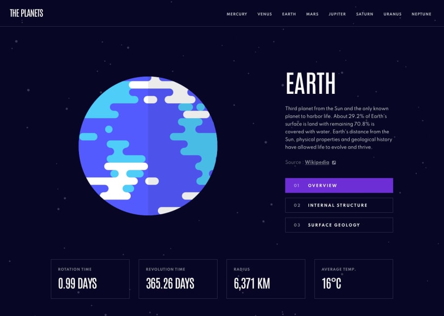
React, Sass, React-Bootstrap, React-Redux, Redux Toolkit, React-Router
Design comparison
Solution retrospective
Primarily my biggest issue is getting the surface image to show up "better" on mobile devices when it comes to styles.
Was a bit lazy about the content in the mobile nav but the biggest issue is the "jumpy" part of the navigation bar. Any ideas/suggestions here?
First full project using all the tools available in this project but always open for suggestions with better ways to write logic for the site especially for the Redux side of things.
Community feedback
- @afrusselPosted over 3 years ago
When open mobile nav there is a gap between top bar and nav list. More over when click on each item nav not close after click on items
3@codejohnson89Posted over 3 years ago@afrussel Hi! I have made an update to fix the gap and when an menu item is clicked on mobile it will close the dropmenu. Please feel free to review again when you have the opportunity.
Thanks!
0
Please log in to post a comment
Log in with GitHubJoin our Discord community
Join thousands of Frontend Mentor community members taking the challenges, sharing resources, helping each other, and chatting about all things front-end!
Join our Discord
