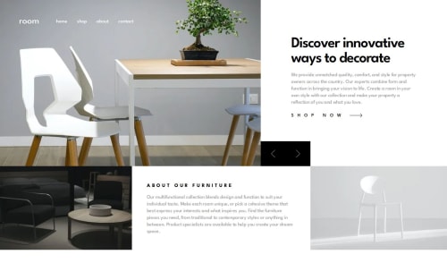
React Room homepage
Design comparison
Solution retrospective
Responsive and accessible Room homepage layout with optimized fonts and images. React components:
- Animated slider
- Dialog
- Slider controls
- Dynamic article
Community feedback
- P@elisilkPosted 3 months ago
Hi 👋 @NikitaVologdin,
Congrats on an excellent solution. 👏
I really love the animations/transitions you've implemented. I'm especially impressed with how you have a separate animation for the photo versus the associated text. I think that looks really nice. And the animation of the mobile menu is well done too.
If you are up for diving in 🤿 a little further, here are a couple small things I noticed:
First, in the mobile viewport (375px wide), it looks to me like the flex container for the mobile popup menu is too crowded and that is causing the svg close icon to get smushed to 0px and also for there to be a horizontal scroll for the navigation menu. One option would be to lessen the
gap
property for the.nav__list
class and that would solve the issue.Second, looking at the lighthouse metrics for your solution, I see that in the "Best Practices" section there is a note about "Displays images with incorrect aspect ratio". Looking more closely at the design, those two images in the bottom row don't have the same aspect ratio, and so they take up slightly different widths in the desktop view (420px vs 440px) and slightly different heights in the mobile view (238px vs 227px). To start, I'd suggest changing the HTML attributes of both images to be their intrinsic sizes:
<img src="/images/image-about-dark.webp" class="content__image content__image_dark" width="420" height="266" alt="" loading="lazy"> <img src="/images/image-about-light.webp" class="content__image content__image_light" width="440" height="266" alt="" loading="lazy">
The image will still be responsive as those intrinsic sizes will set up the correct aspect ratio for each image. Then you can set the CSS so that the images fill their container and calculate the appropriate height based on their intrinsic aspect ratios. So for
.content__image
, something like:.content__image { width: 100%; height: auto; }
Here is a great article for some background reading 📚:
Setting Height And Width On Images Is Important Again by Barry Pollard on Smashing Magazine
Then thinking of the
.content
flex container, that part can get a little tricky and there is not one best way. How you ultimately solve it is probably based a lot on how you want the container to change as you move from the narrower viewports to the wider ones. So there are different possibilities.Anyway, just some ideas to consider if you are thinking about improving on your solution. 🤔
Great job overall! Happy coding. 💻
Eli (@elisilk)
Marked as helpful0 - P@NikitaVologdinPosted 2 months ago
Nice to see you again @elisilk!
- Resolved your notice by giving position absolute for the button to keep paddings for a better user experience (easier tap with finger)
- I Always had this issue with images, thanks to you, I finally understood to take sizes from image properties, not Figma design.
Thank you for your time, detailed feedback and provided article.
Best, Nikita.
0
Please log in to post a comment
Log in with GitHubJoin our Discord community
Join thousands of Frontend Mentor community members taking the challenges, sharing resources, helping each other, and chatting about all things front-end!
Join our Discord